
The Client
Spiritually, Gina is a practitioner based in North Carolina, offering services such as tarot/oracle readings and chakra healings.
Collaboration Context
This project involved collaboration with GigiOnBrand, a Los Angeles-based brand strategy agency. While the agency may have guided the overall brand strategy, I served as the Graphic Designer responsible for creating the complete visual identity system.
The Challenge
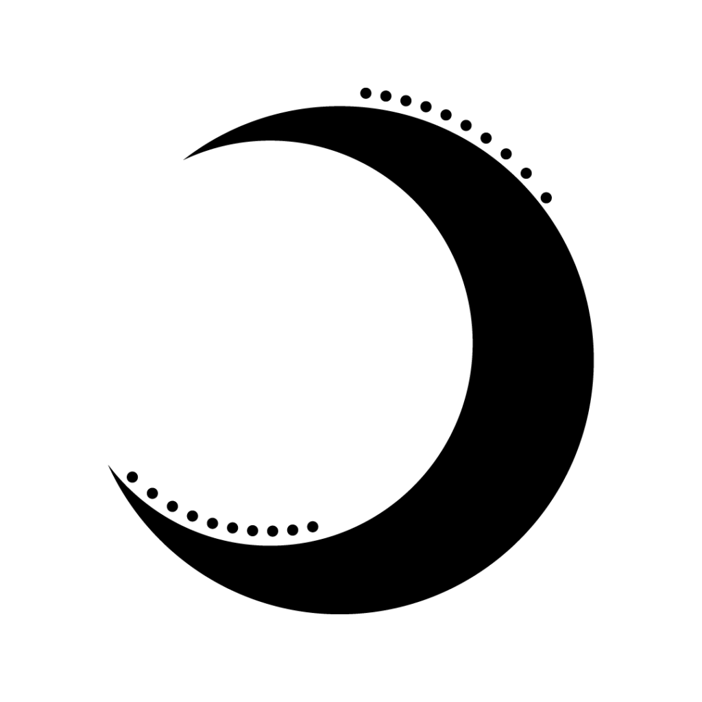
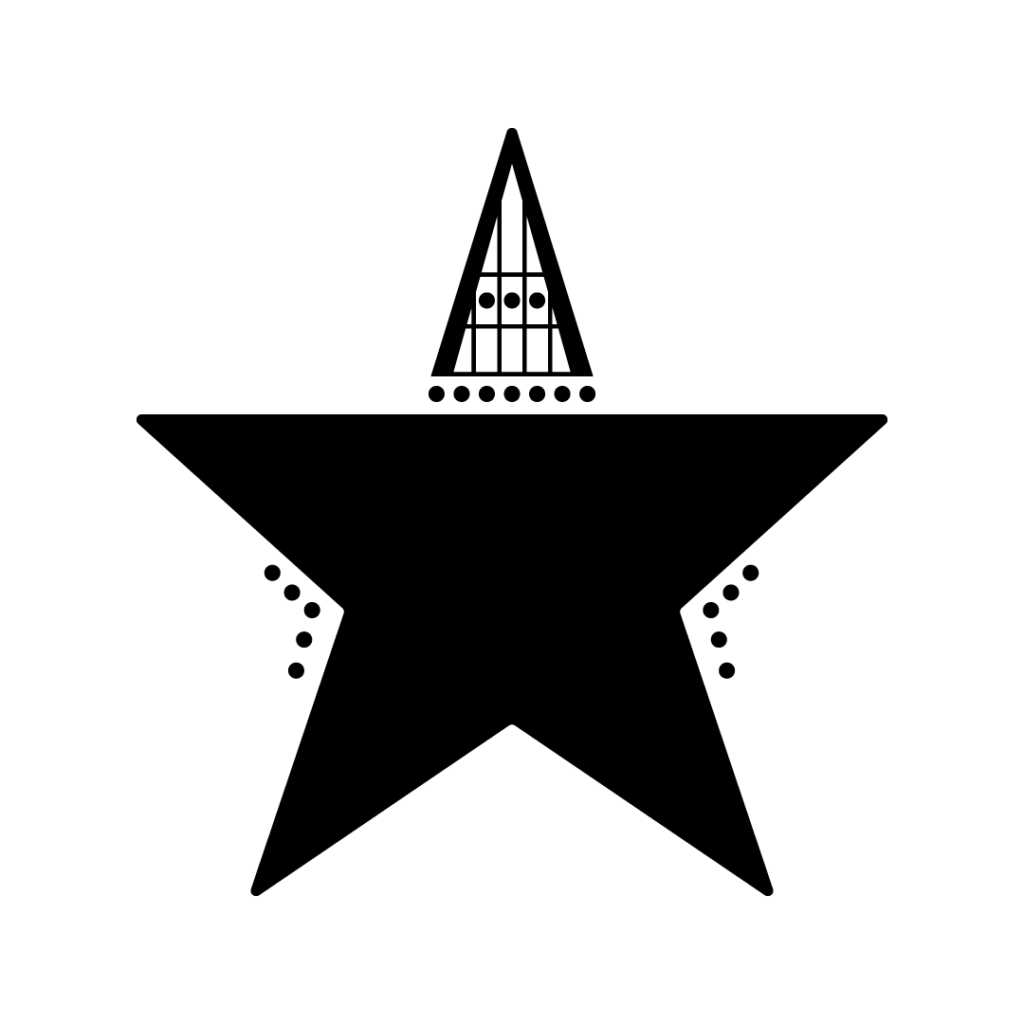
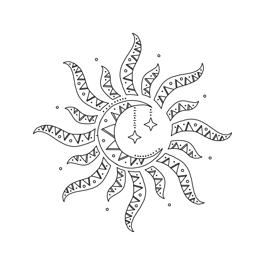
Spiritually, Gina’s existing visual identity utilized three separate icons (sun, moon, star), lacking a single, versatile primary mark for effective brand application. The primary challenges were to consolidate these elements into one cohesive logomark and to develop a complete visual identity – including a unique custom typeface and color palette – that authentically reflected the brand’s organic, non-traditional, and spiritual essence.
My Role
As the Graphic Designer, I created the full visual brand identity system for Spiritually, Gina. My responsibilities included redesigning the logomark, defining the color palette, designing the custom ‘Jelly Pen Type’ script font, and preparing all creative assets using Procreate (for font creation), Adobe Illustrator, and Photoshop.
Strategy & Approach
Guided by the client’s spiritual focus and the desire for a more cohesive and organic identity (likely informed by GigiOnBrand’s strategic direction), the visual approach centered on unifying the core brand symbols and developing a unique, handcrafted typographic voice. The strategy was to create visuals that felt personal, mystical, and intentionally distinct from conventional aesthetics, ensuring all elements (logo, font, color) worked together harmoniously.
Design Process
Analyzed the previous three separate icons (sun, moon, star). Explored various methods to integrate these celestial elements into a single, balanced, and meaningful symbol. Refined the chosen combined concept for clarity and scalability using Adobe Illustrator and Photoshop.


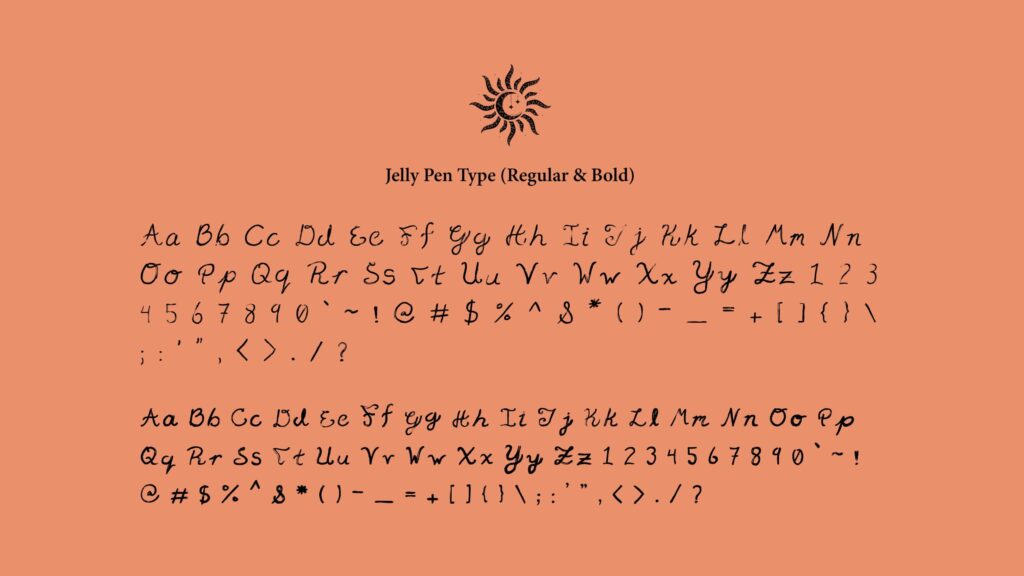
Custom Font Creation (Jelly Pen Type)
Embraced the client’s request for an “unorthodox” typeface. Focused on developing letterforms with an organic, fluid quality using Procreate, intentionally deviating from standard typographic structure to achieve the unique, handwritten aesthetic desired. Prepared the font for practical use.
Swatch Panel
Big Stone
Hex: #19243A
Apricot
Hex: #EA906A
Apricot
Hex: #E9D1AE
The Solution
Delivered a unique and cohesive visual identity system tailored to the brand’s spiritual nature:
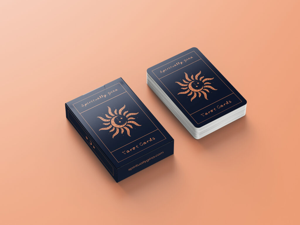
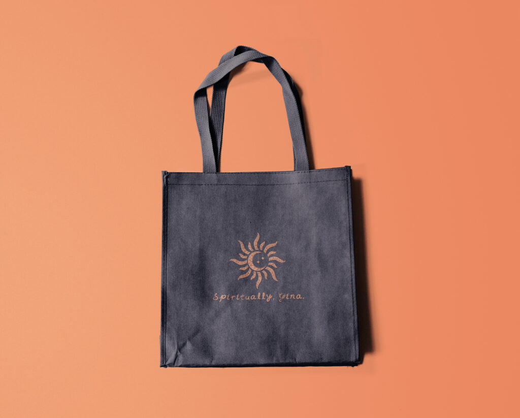
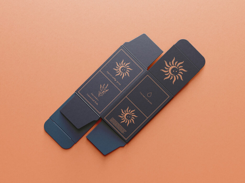
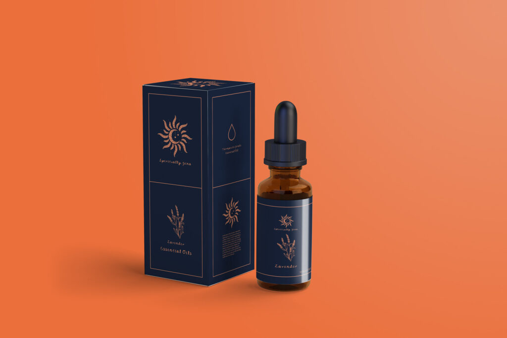
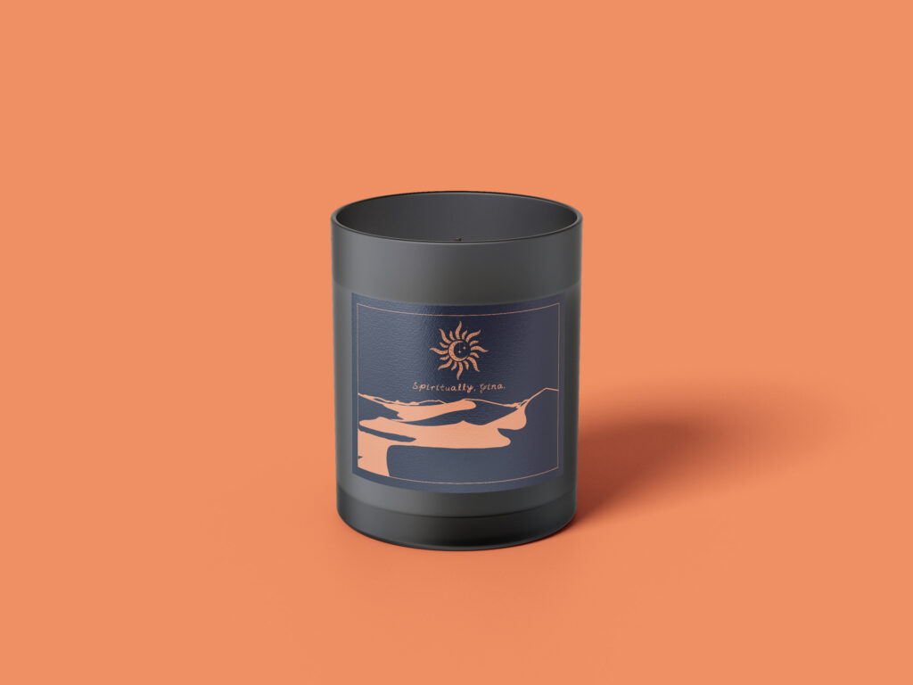
- Unified Logomark: A redesigned symbol effectively merging the sun, moon, and star elements into one cohesive mark, providing a stronger, more versatile primary visual identifier.
- Custom Typeface (‘Jelly Pen Type’): A unique script font crafted specifically for the brand using Procreate, featuring organic, unconventional letterforms. This typeface delivers a distinctive, personal feel and was designed for use within the logo itself and across heading titles.
- Color Palette: A distinct palette was established, grounding the identity in deep navy blue while introducing warmth and subtle energy through lighter, muted tones of salmon and burnt orange. This combination aimed to evoke a balance of intuition, warmth, and groundedness.
- Integrated System: All elements – the unified logomark, the custom script font, and the defined color palette – were designed to work together seamlessly, creating a consistent and unique brand expression across various mediums.
Results & Impact
- The redesigned visual identity was successfully implemented, providing Spiritually, Gina with versatile and cohesive assets for consistent use across all brand touchpoints, directly addressing the initial challenge.
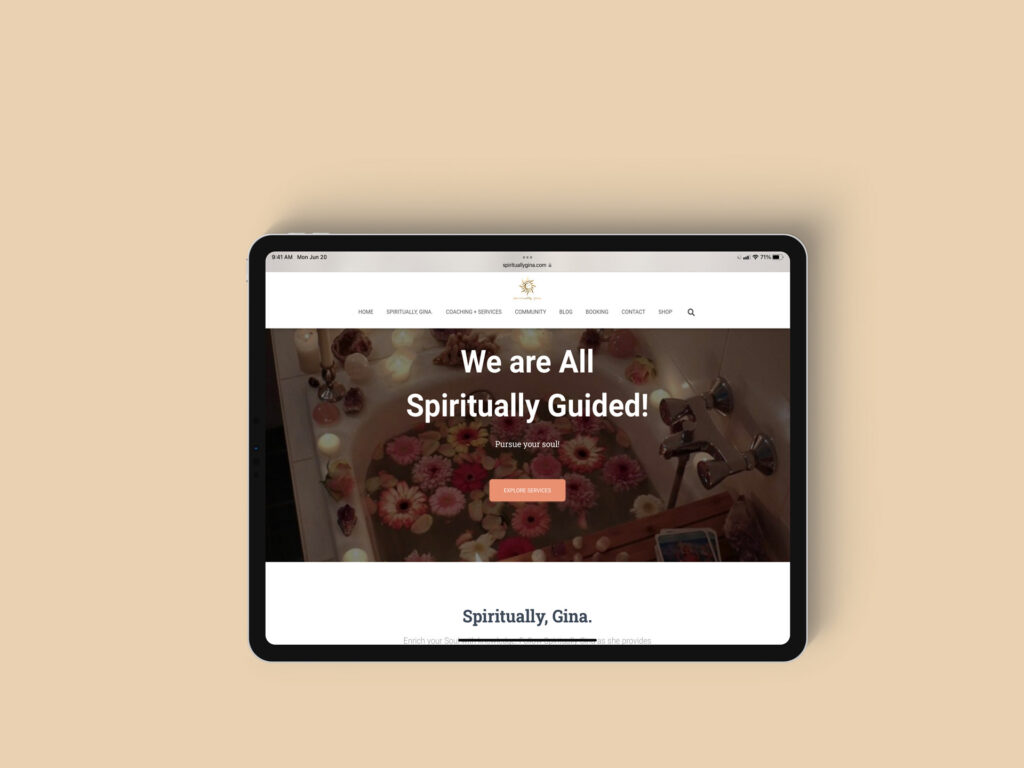
- The robust identity system created (logo, font, palette) later facilitated the seamless development of derivative brand materials, including custom tarot cards and serving as the foundation for a new website designed by another creative.
- The positive outcome and successful collaboration on this project directly led to further freelance opportunities for me with the GigiOnBrand agency on subsequent client projects, such as the Dela V Cannabis brand identity.
Mockups
Leave a Reply