Client
Field Trip, operating as a subsidiary of Cake Cannabis in Tulsa, OK
The Challenge
Field Trip needed to enhance and extend their existing playful brand identity across crucial touchpoints. Key requirements included refining their logo system for versatility, designing compliant and engaging mylar bag packaging for their cannabis products, and developing an apparel line to create additional monetization opportunities. The core challenge was to evolve the brand's application while staying true to its established lighthearted, cloud-themed aesthetic.
My Role
Collaborating directly with the founder (a previous colleague) in the fall of 2021, I spearheaded the packaging design initiative. My contributions included refining the logo system, designing the mylar bag packaging (including die lines), and conceptualizing and preparing an initial apparel line (including tech packs).
Strategy & Approach
The strategy focused on leveraging Field Trip's established playful identity – characterized by its cloud-style wordmark and kite motif – and extending it cohesively. We aimed for simple, memorable designs that captured a lighthearted, accessible vibe suitable for the Tulsa market. The approach involved extracting key visual elements (clouds, kites, open fields) to build upon and ensuring all new designs were production-friendly for cost-effective manufacturing.
Design Process
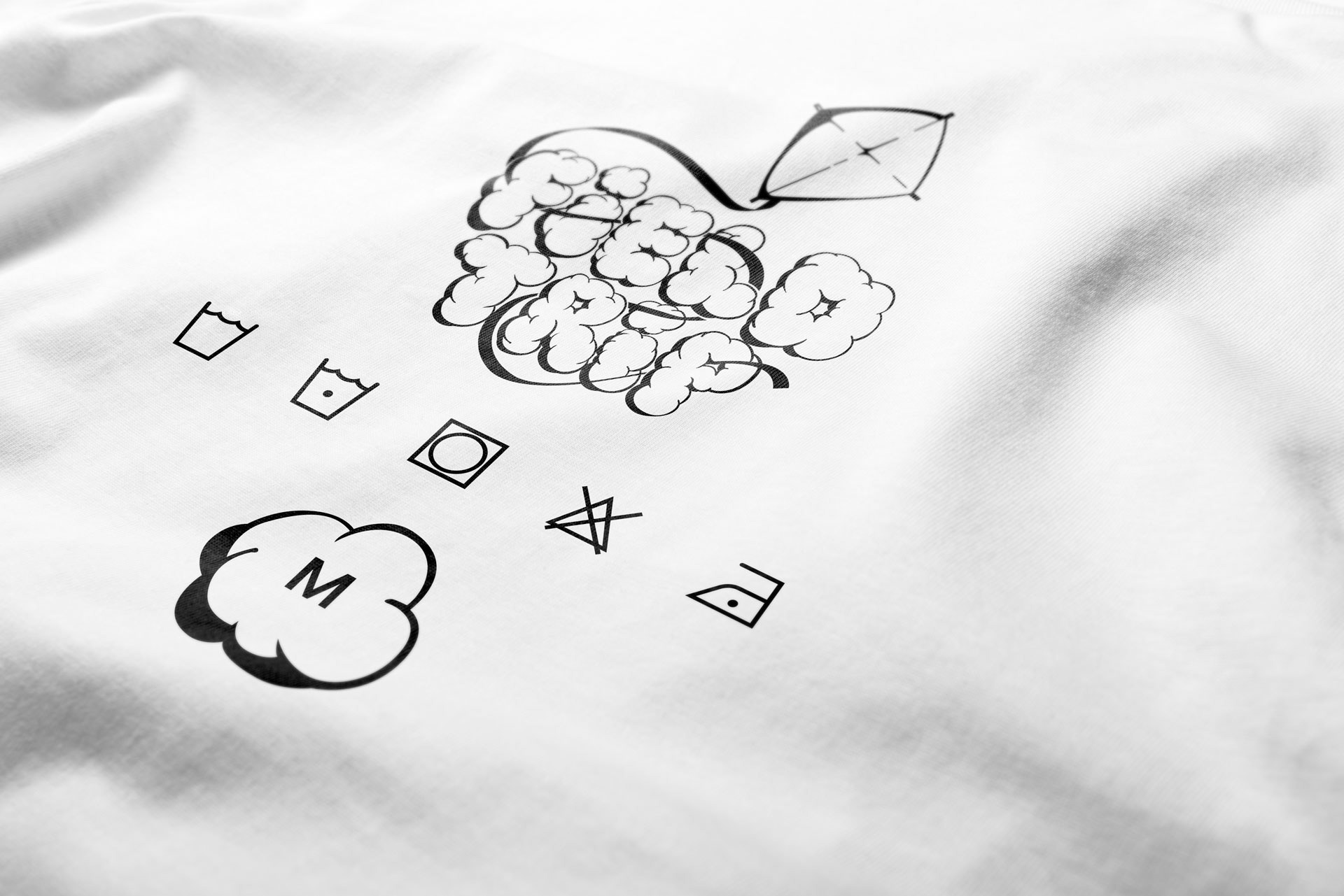
Logo Refinement
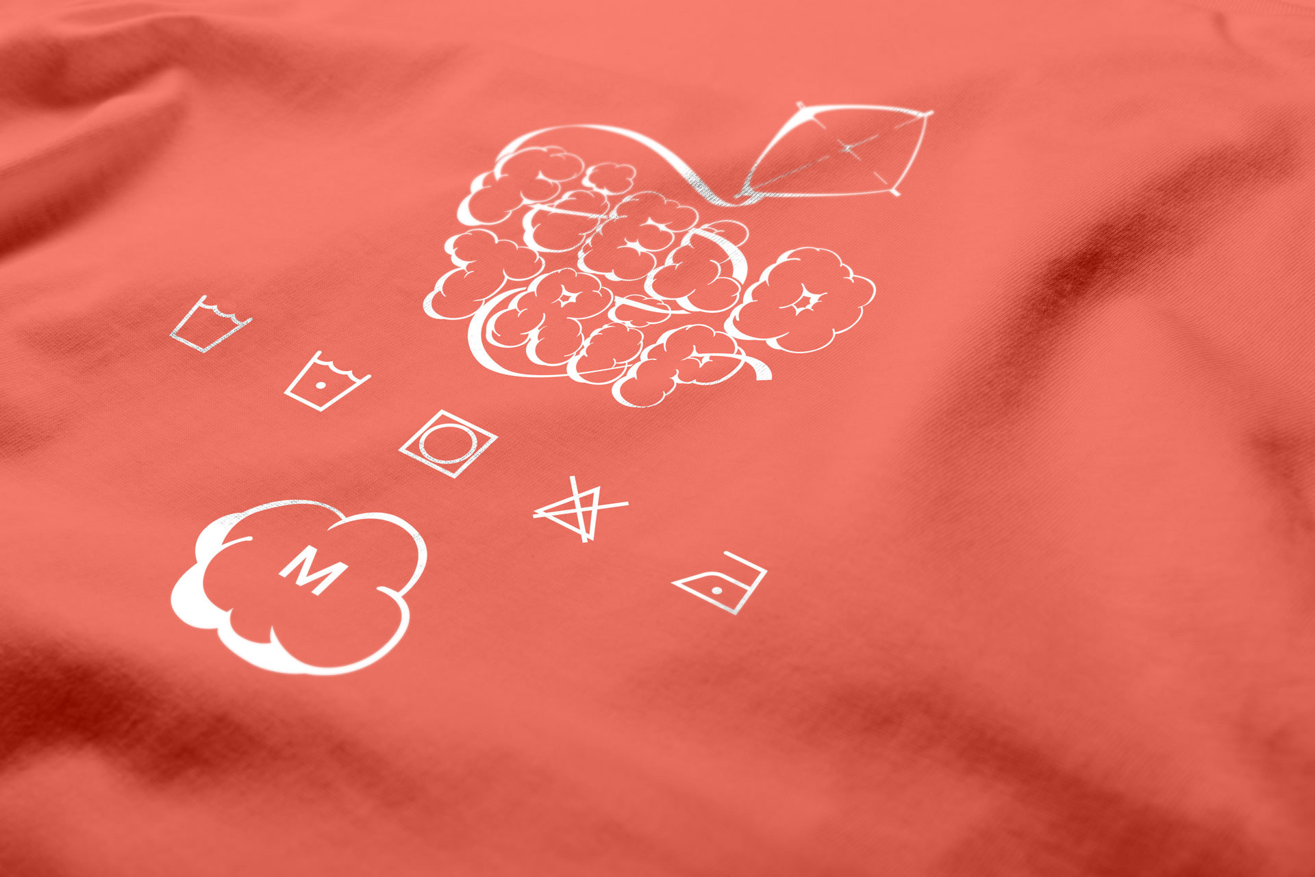
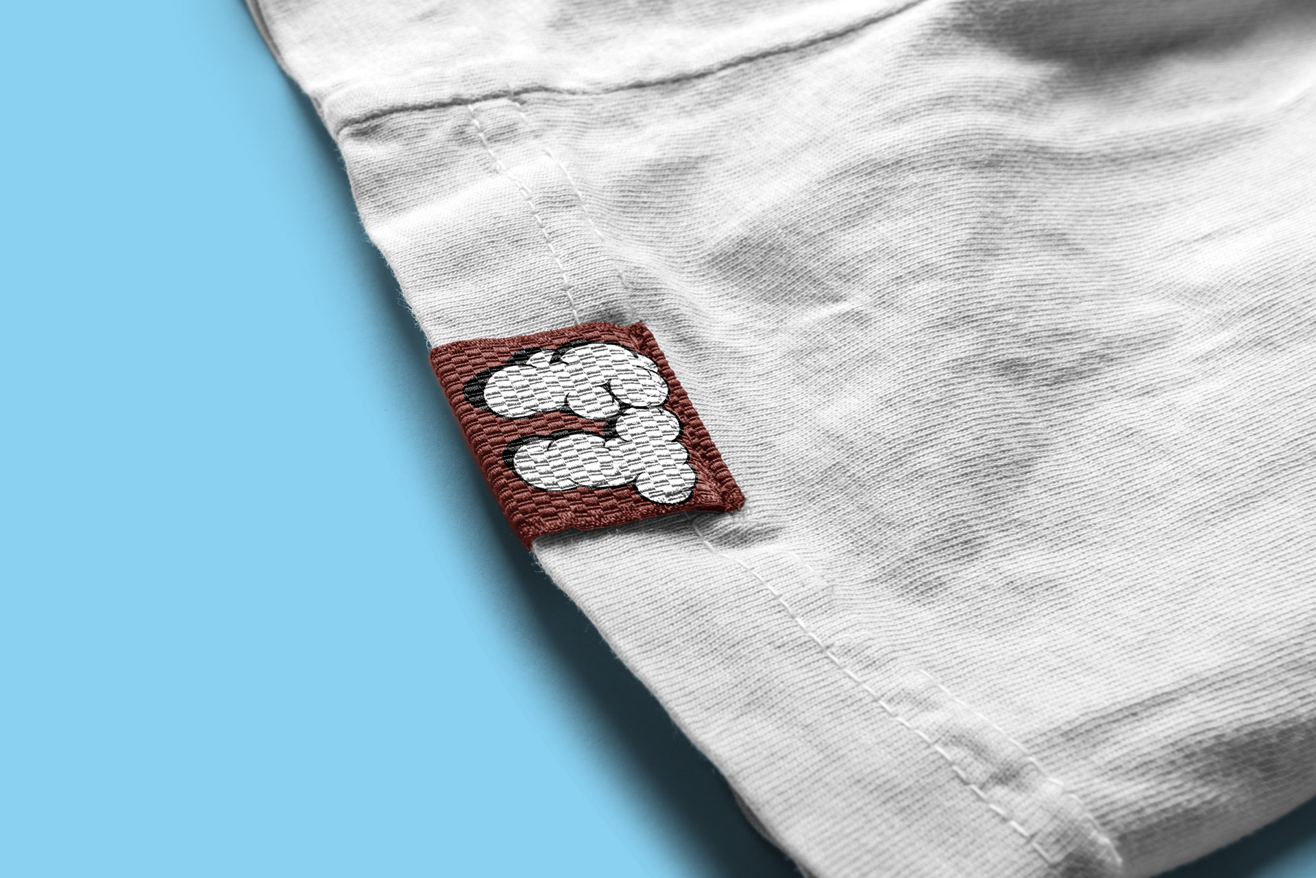
Analyzed the original large logo lockup (cloud lettering 'Field Trip' with a kite). Identified the need for a more compact version for smaller applications. Developed a secondary, short-form "FT" logo mark rendered in the identical cloud style to ensure brand consistency and scalability.A
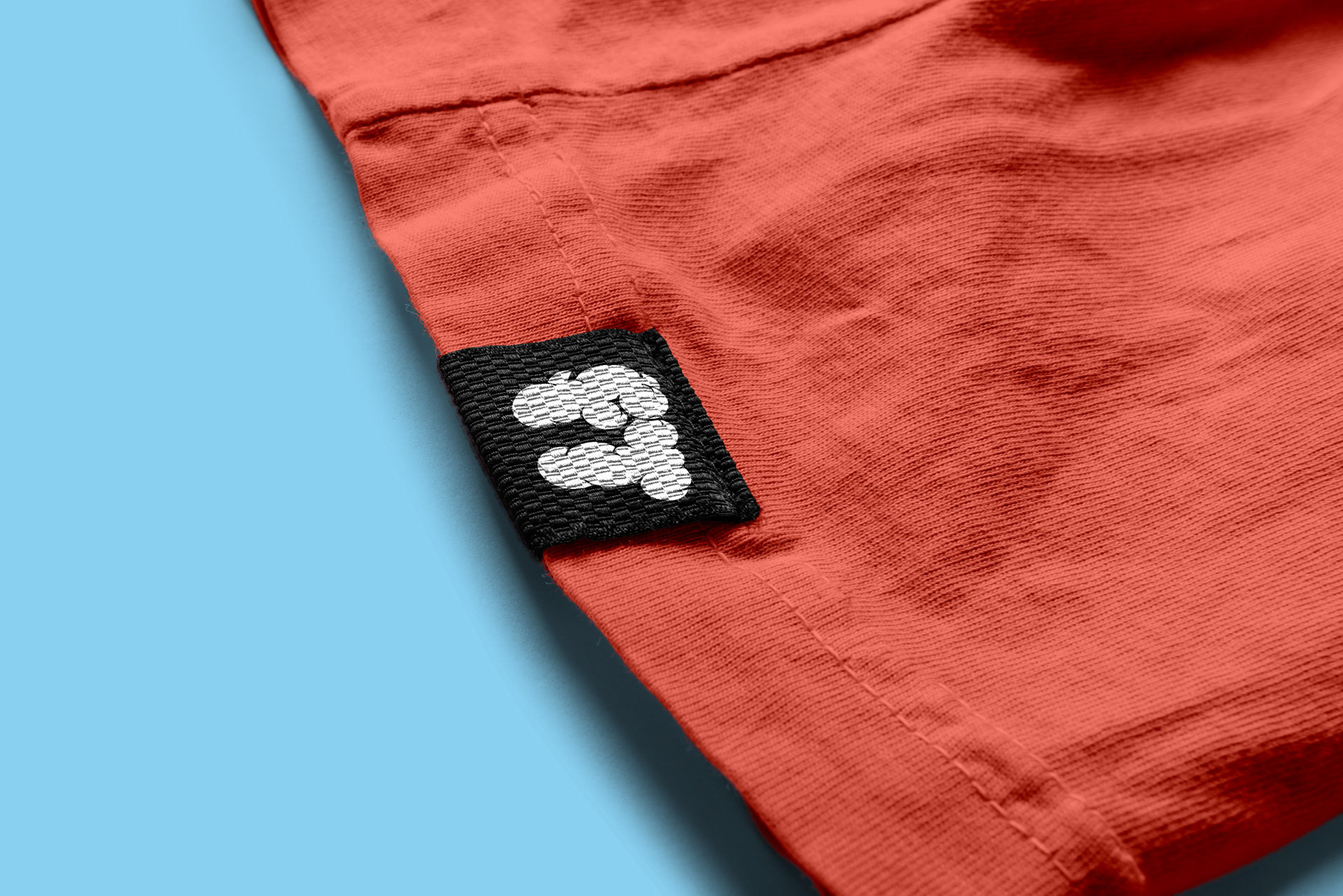
Secondary Logo
Packaging Design
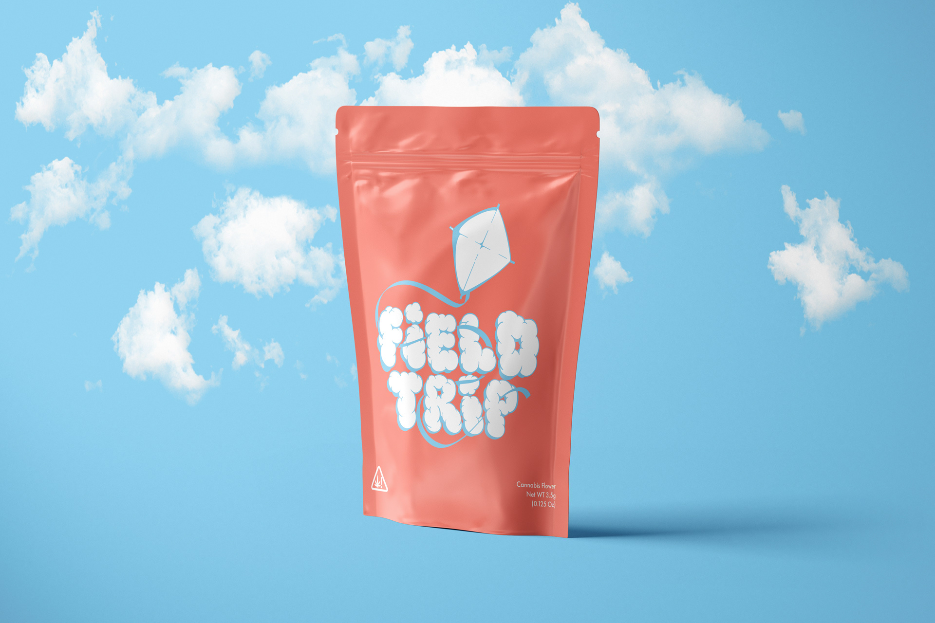
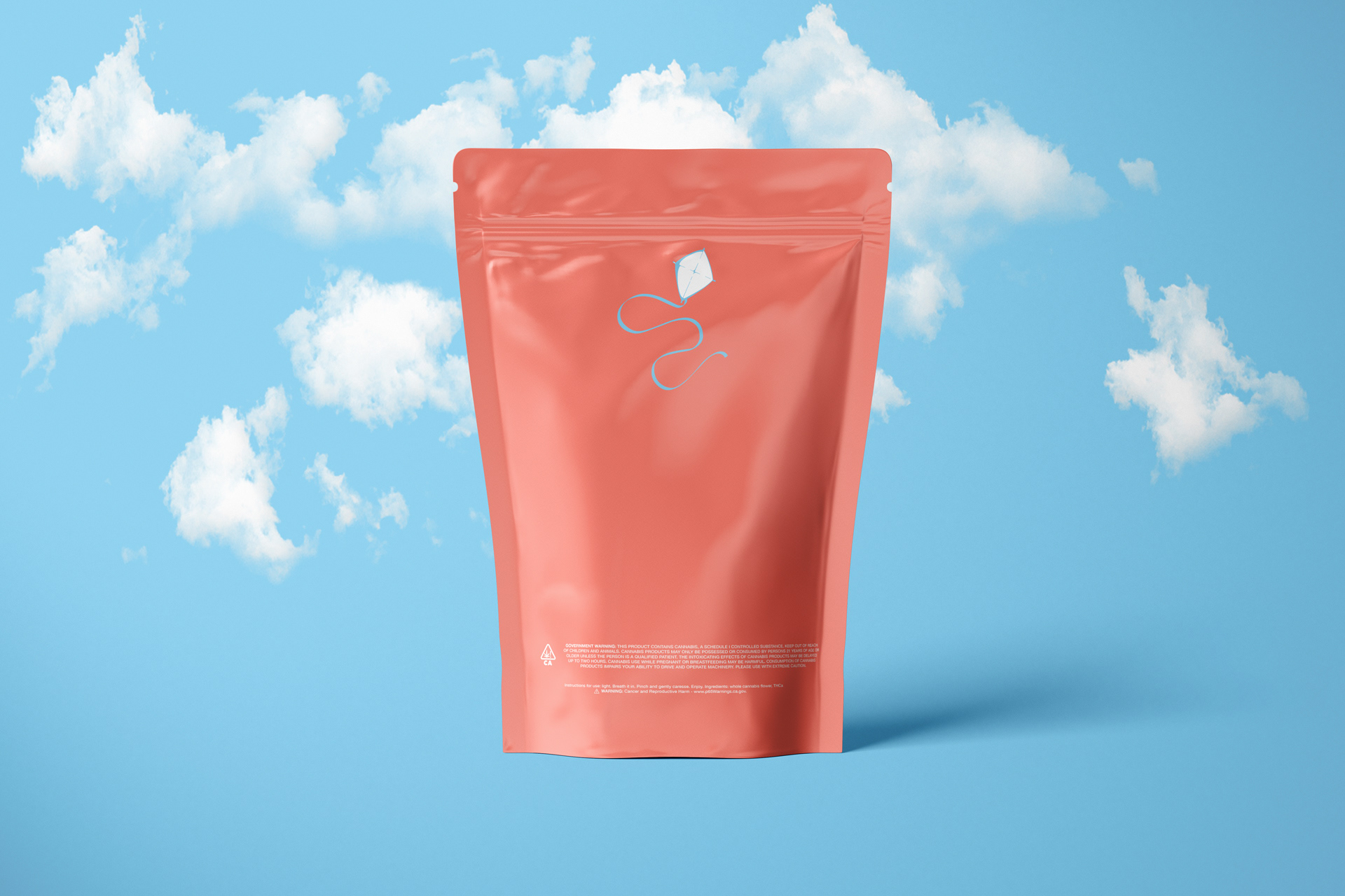
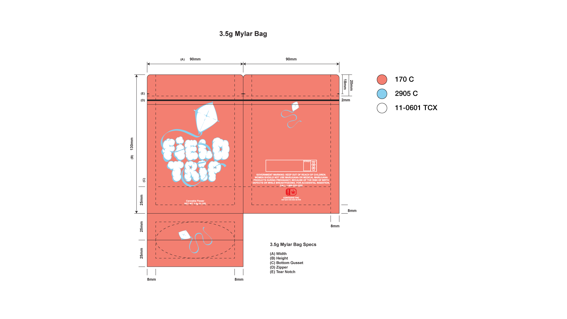
Explored the playful visual themes (clouds, fields, blue skies). Designed the mylar bag layout prioritizing simplicity and brand recognition, featuring the primary logo lockup prominently. Incorporated compliant ingredient list requirements. Developed precise die lines for production.
Apparel Concepts
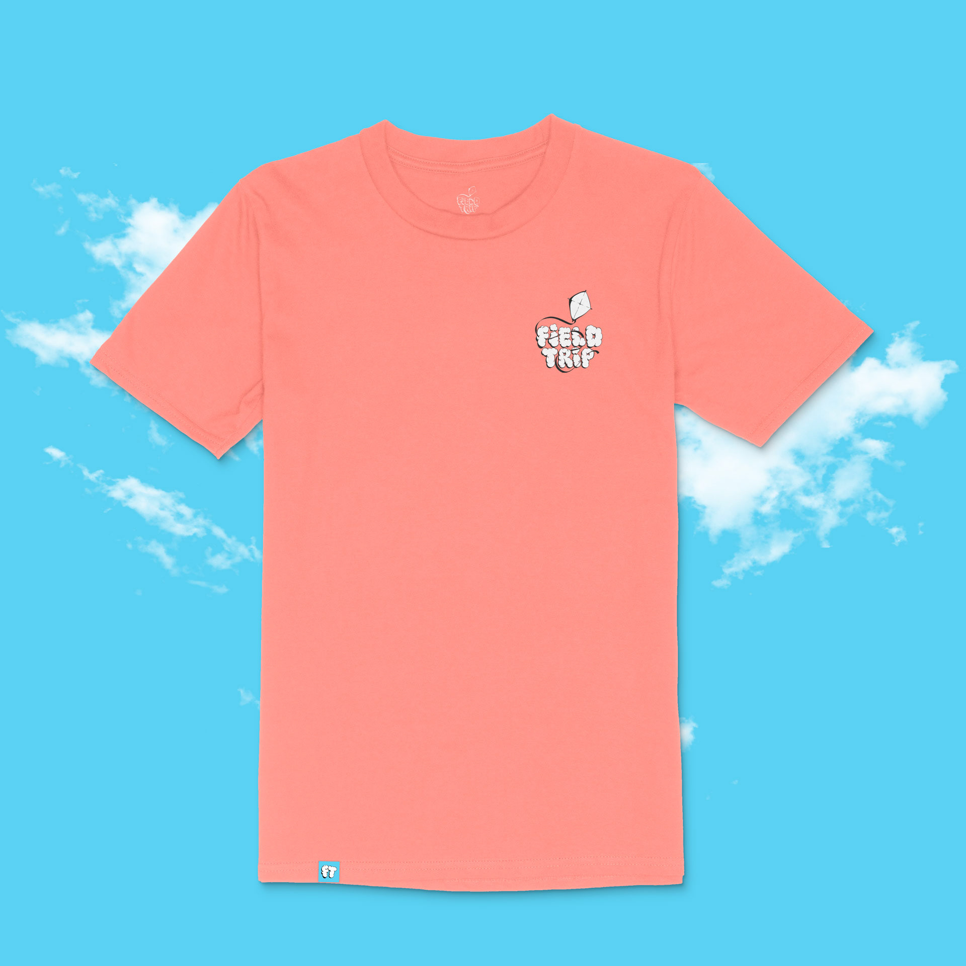
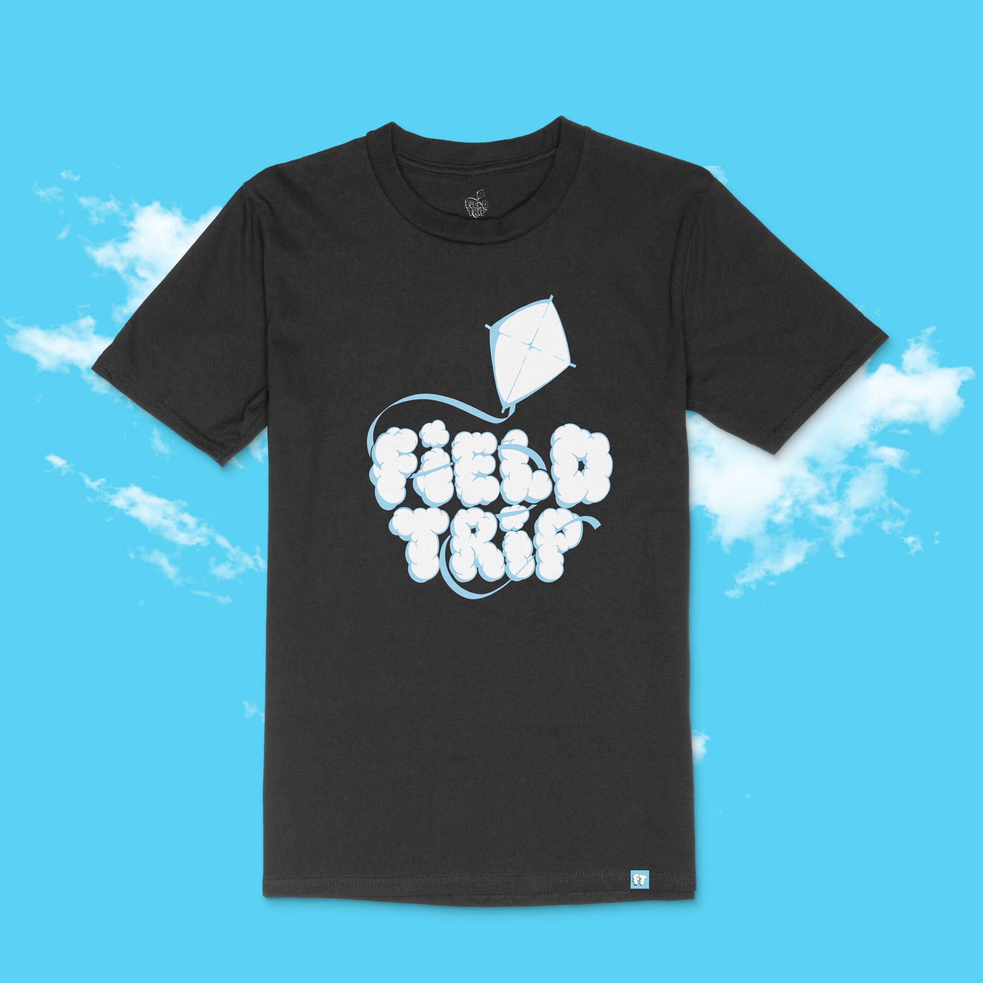
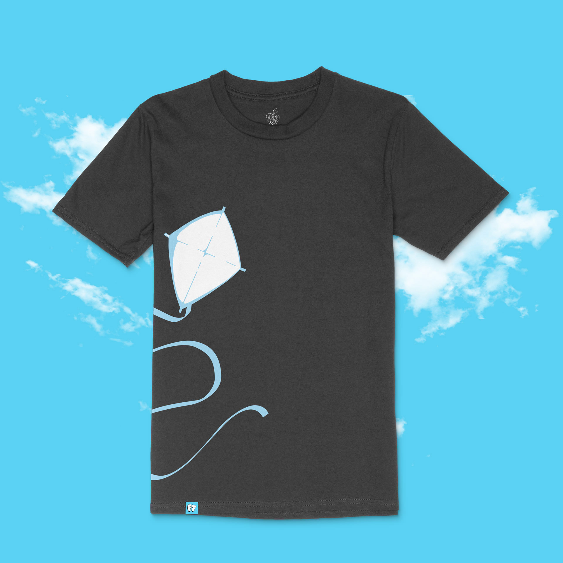
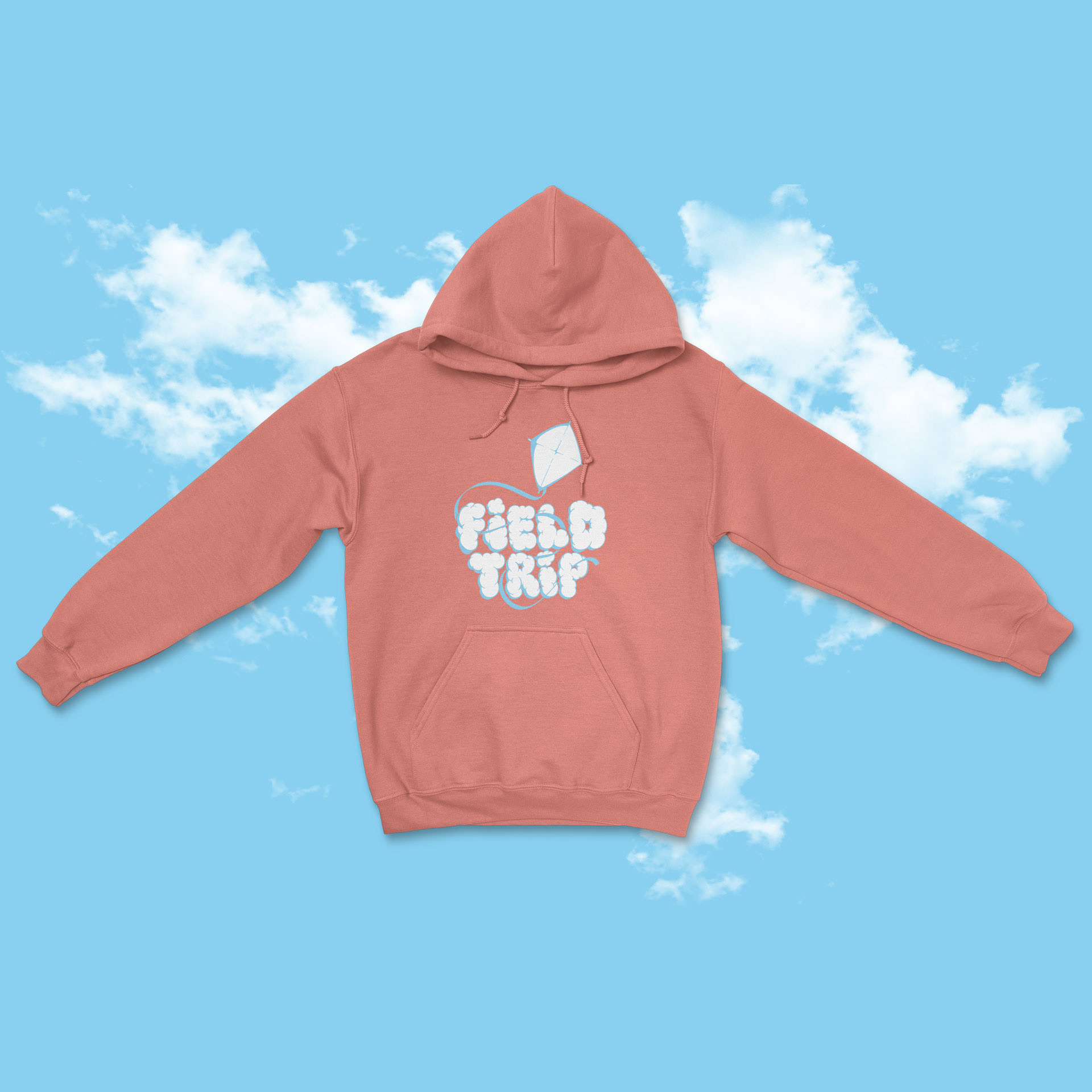
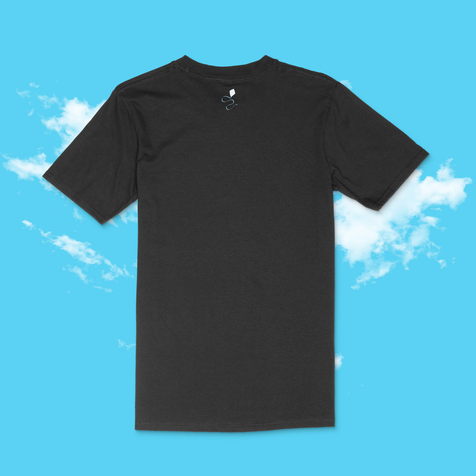
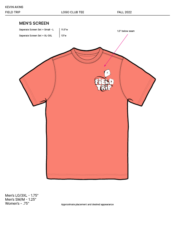
Conceptualized three distinct graphic tee designs to offer variety: a classic block-logo tee, a trendy pocket-logo design (inspired by Gallery Dept. aesthetics), and a dynamic graphic tee utilizing the kite element down the side. Prepared detailed tech packs to streamline the printing process.

Swatch Panel

The Solution
The project delivered a refined and expanded set of brand assets designed for consistency and appeal:
• Refined Logo System: Introduced a versatile "FT" cloud-letter secondary mark for flexible use alongside the original logo lockup.
• Mylar Bag Packaging: A clean, playful design featuring the primary Field Trip logo on a distinctive solid coral background with sky-blue accents, creating an approachable yet memorable product presence. Included compliant layouts and production-ready die lines.
• Apparel Line: A curated collection of three graphic tee designs offering different styles while consistently reinforcing the Field Trip brand identity. Delivered with detailed tech packs for efficient manufacturing.
Results & Impact
The client expressed strong satisfaction ("loved the design work and decisions") with the enhanced brand elements and new product designs. The provision of detailed die lines and tech packs facilitated smoother, more efficient production processes for both packaging and apparel. Significantly, the success and quality of this project served as a valuable portfolio piece, directly leading to subsequent opportunities and connections with other cannabis clubs seeking brand identity and consumer packaged goods design expertise.
Mockups