
Client
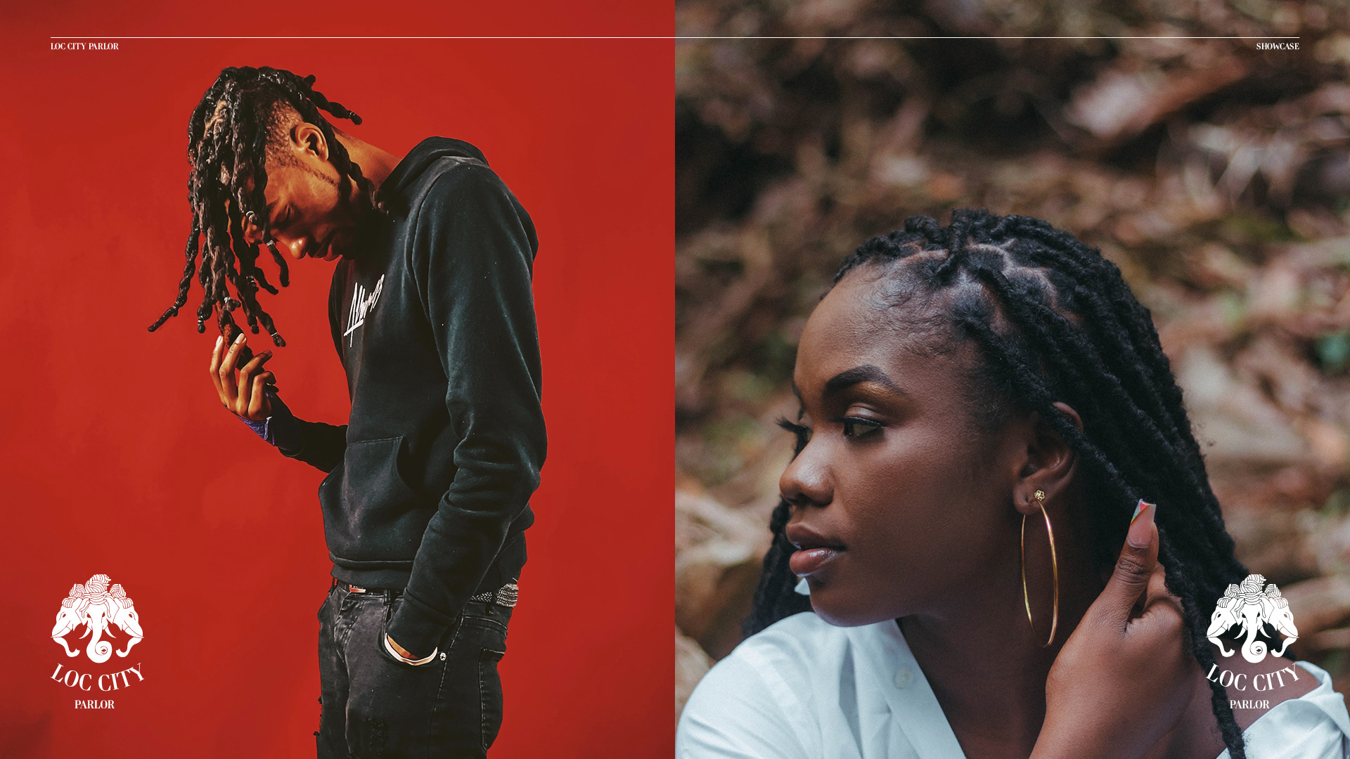
Loc City Parlor is a renowned hair salon with legendary status across Northern California (Sacramento to the Bay Area), specializing in exceptional locs and twists. Founded and owned by loctician Phet Phomthisane, the brand is distinguished by its unique identity that seamlessly blends Lao and African cultural elements and fosters a welcoming, diverse community.
The Challenge
Loc City Parlor needed a formal visual identity, primarily a logomark, that could authentically capture and communicate its unique essence. The key challenge was to create a symbol that visually represented the fusion of Lao and African cultures, honored the heritage and artistry of locs (while helping dismantle stereotypes), and resonated deeply with the salon's established community and potential clients embarking on their loc journey.
My Role
Collaborating closely with owner Phet Phomthisane beginning in 2020 (marking my return to design after a two-year hiatus), I served as the designer responsible for concept exploration, cultural research, and the design and refinement of the final iconic logomark and typographic choice.
Strategy & Approach
The initial strategic direction, driven by the owner's vision, explored adapting a luxury fashion aesthetic (Versace) using Lao cultural symbols (elephant) and custom patterns. However, as the project evolved, the core strategy shifted towards prioritizing authentic cultural representation and deeper symbolic meaning over borrowed luxury motifs. A crucial part of the approach involved dedicated research into both Lao history/symbolism and the specific cultural significance and history of locs (understanding their distinction from dreadlocks) to ensure the final identity was respectful, meaningful, and truly representative of the Loc City community.
Design Process
Research
The process commenced with exploring the owner's initial Versace-inspired concept: a Lao elephant adorned with locs, framed by a custom "LC" pattern replacing the Greek key. My subsequent research phase involved a deep dive into the cultural nuances and distinct histories of locs, recognizing their global heritage and differentiating them from the specific cultural context of dreadlocks. This understanding highlighted the importance of choosing symbols with inherent cultural weight. Concurrently, research into Lao heritage uncovered the powerful symbolism of the three elephants featured on the flag of the former Kingdom of Laos. This deeper cultural understanding directly informed the visual exploration, moving away from the initial Versace motif.
Iteration 1
An early concept featured a side-view illustration of an elephant adorned with loc-style hair, drawing artistic inspiration directly from the single elephant often depicted in Lao cultural symbols.
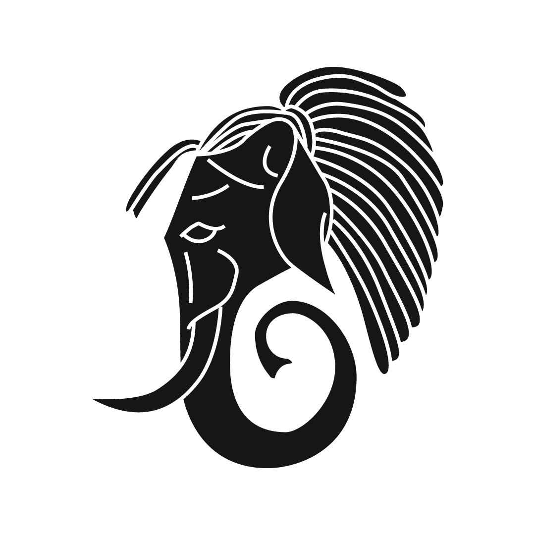
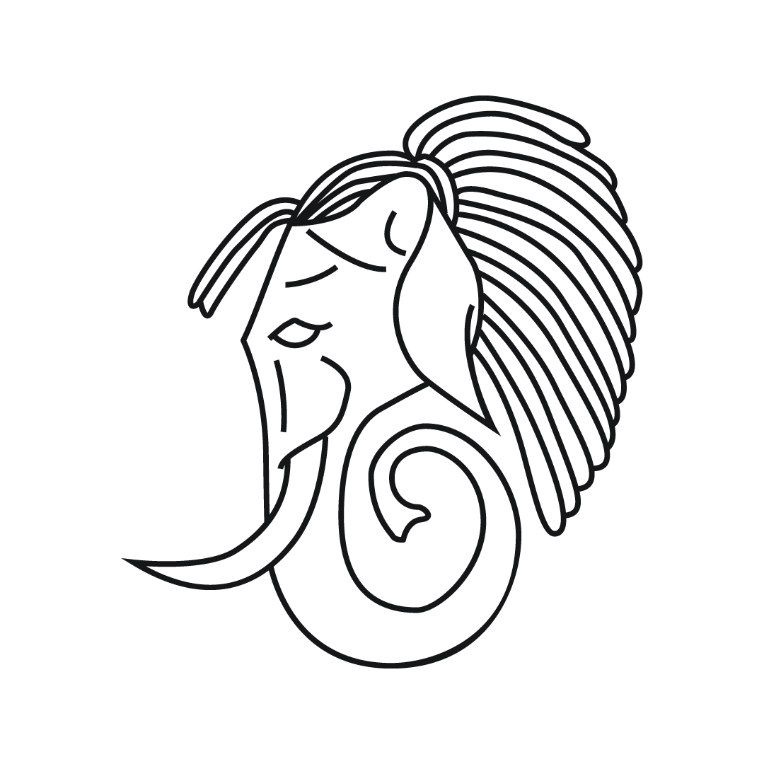
Iteration 2
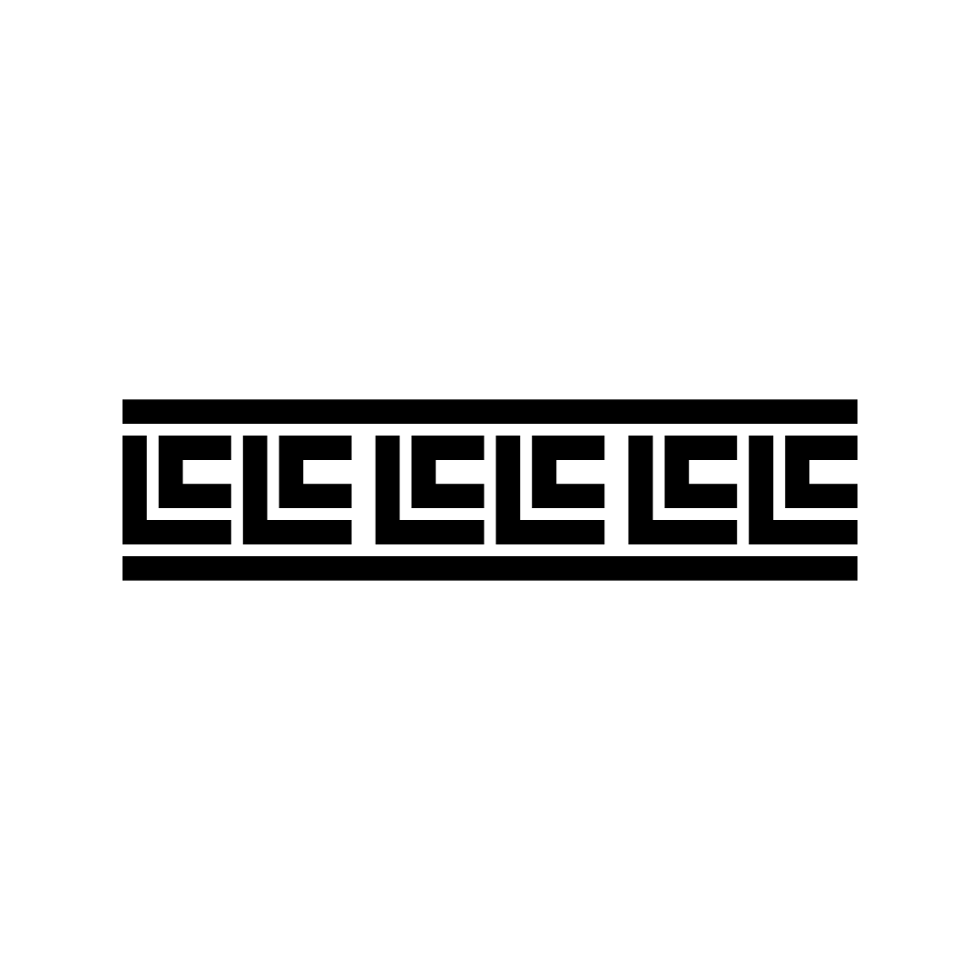
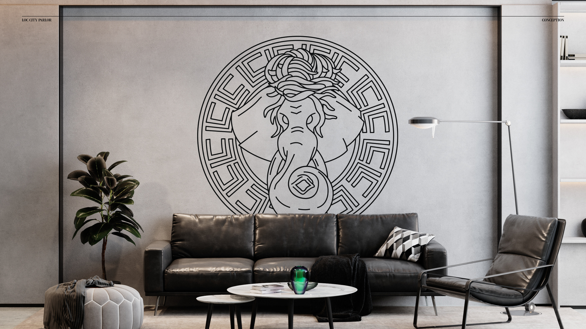
A subsequent iteration evolved this idea into a front-facing elephant head with loc-style hair, encircled by a custom Greek key-inspired pattern (revisiting the initial luxury concept exploration but aiming for more relevant symbolism).


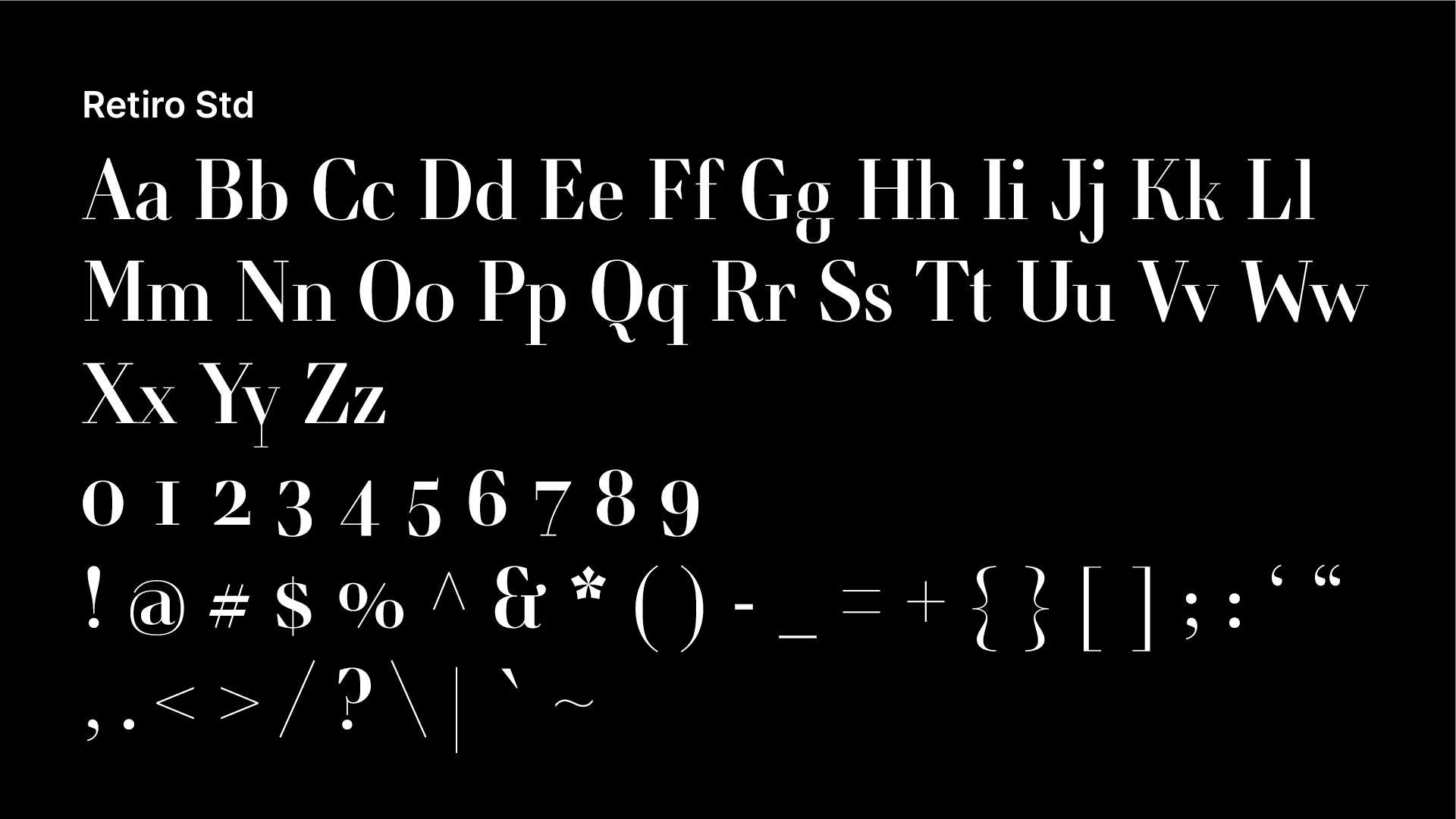
Font Selection
Final Direction
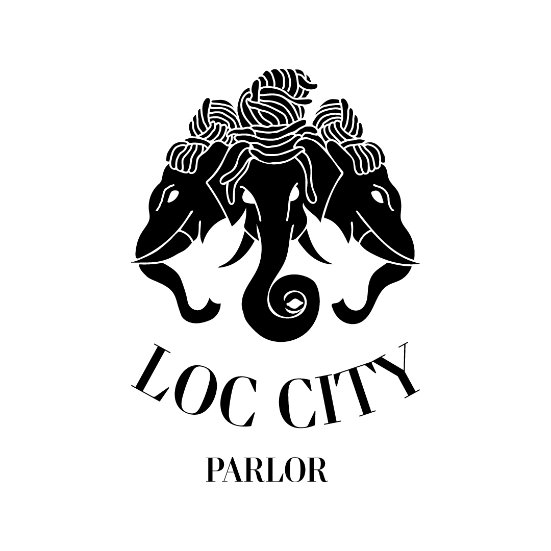
While these explorations were valuable, reflecting on the research into Lao history ultimately led to the decision that directly utilizing the three separate elephants from the historic Kingdom of Laos flag offered the most powerful and authentic representation, fully embracing the discovered symbolism and cultural fusion central to the brand.
The Solution
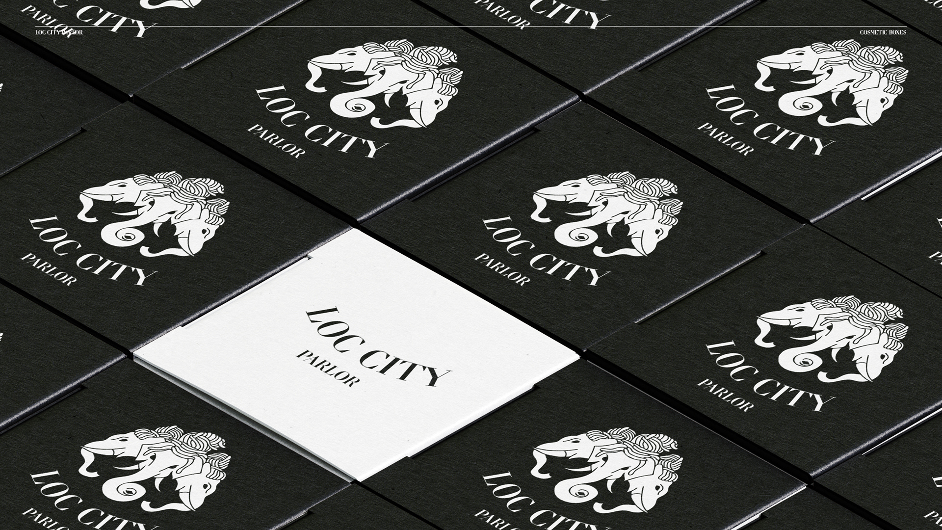
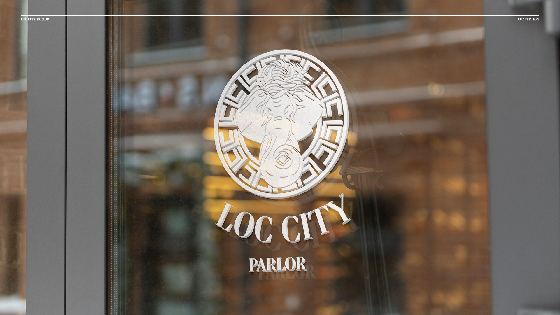
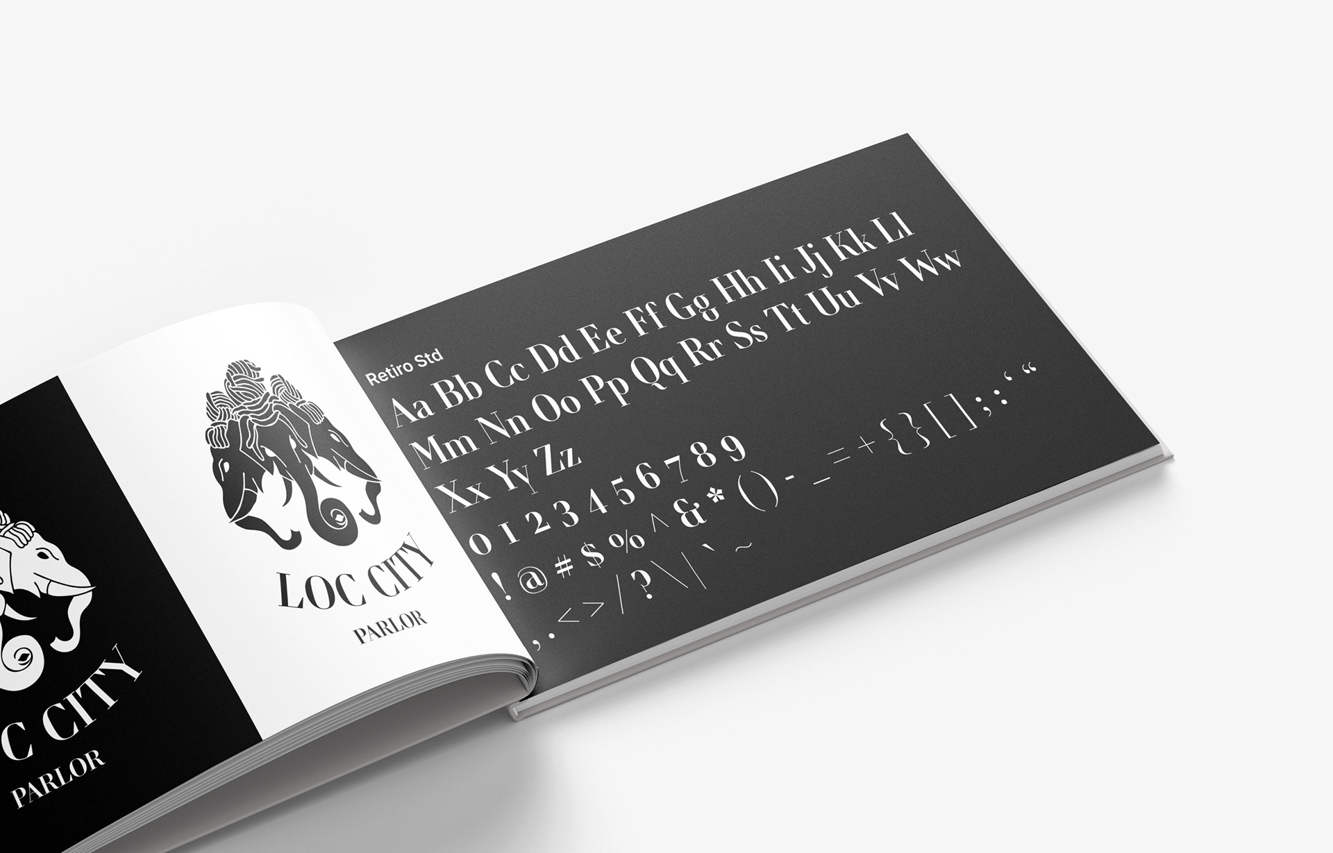
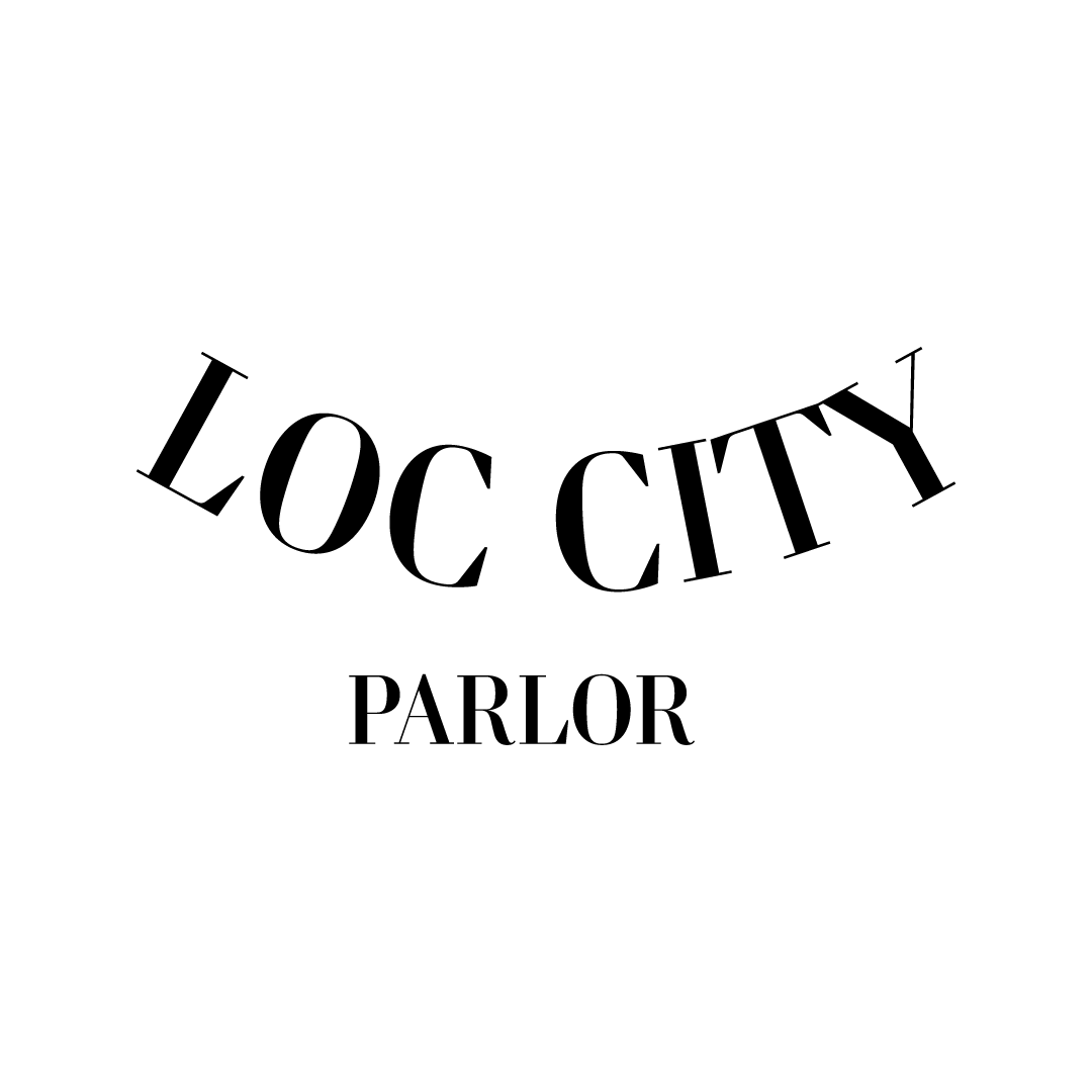
The final, iconic logomark for Loc City Parlor features the three elephants derived from the historical flag of the Kingdom of Laos, distinctively adorned with loc-style hair. This powerful symbol was ultimately chosen for its ability to profoundly resonate with the brand's unique identity. It masterfully encapsulates the rich cultural fusion of Lao heritage (elephants) and Black hair artistry (locs), celebrating the diverse community Loc City Parlor serves and honoring the deep roots associated with loc journeys. Complementing the regal nature of the logomark, the elegant serif typeface Retiro Std was selected; its distinctive serifs strike a harmonious balance between luxury and authority, further reinforcing the brand's prestigious yet culturally rooted identity.
Results & Impact
The final logomark, deeply rooted in cultural symbolism, was successfully adopted by the client. It has since become a highly recognizable symbol for Loc City Parlor, effectively representing the brand's unique identity and reinforcing its legendary status as a staple service provider across its key regions in Northern and Central California, including Elk Grove/Sacramento, the Bay Area, and the Central Valley.
Mockups