Introduction & Client Goal
Brief: TheBlackManCan is an organization dedicated to celebrating and empowering Black men and boys. Their online presence was previously split across two websites: a .com site for e-commerce and success stories, and a .org site focused on the foundation’s core mission.
Client Goal: To consolidate the two platforms into a single, cohesive .org website that clearly communicates the foundation’s mission, integrates success stories effectively, improves user engagement, and presents a modern, professional brand image.
My Role & Collaboration
Role: Lead Designer (UX/UI & Brand Strategy)
Responsibilities: User research (including competitive analysis), information architecture, user journey mapping, wireframing, prototyping, visual design, and creating UI components/styles in Figma for developer handoff.
Collaboration: Worked closely with developer Tirzah Johnson, who expertly handled the website implementation based on the Figma designs.
The Challenge: A Fragmented Experience
The previous split-site structure created several key challenges:
- Fragmented User Experience: Visitors struggled to get a complete picture, needing to navigate between two distinct sites.
- Brand Dilution: Maintaining consistency in messaging and visuals across two platforms proved difficult.
- Content Silos: Inspiring success stories were disconnected from the core foundation information, lessening their impact.
- Operational Inefficiency: Managing two separate websites demanded duplicated effort.
The primary challenge was to merge these platforms strategically, creating a unified digital presence focused on the foundation’s mission while enhancing the user journey for key personas.
The Process: Research, Strategy & Design
My design process focused on understanding the user, the competitive landscape, and the strategic goals before moving into visual execution.
Discovery & User Understanding
- Persona Definition: We focused on personas like “Marcus,” a young Black man (18-25) seeking inspiration and connection, to guide design decisions. His primary goal: finding relatable stories of achievement and positive identity.
- Competitive Analysis: To understand the landscape, I analyzed competitors like Blavity, AndScape, CassiusLife, etc.
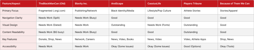
- Key Insights:
- Opportunity for Clarity: Many competitors suffered from busy layouts or unclear navigation, highlighting a need for TheBlackManCan to prioritize a simplified, clean user experience.
- Visual Polish Matters: Sites like AndScape and The Players Tribune demonstrated the impact of strong visual design, setting a benchmark for the redesign.
- Content Focus: The analysis reinforced the decision to focus the merged site on the foundation’s core mission and impact stories, differentiating it from broader lifestyle or publishing platforms.
- User Journey Mapping (Comparative): Based on the persona and goal, I mapped the user journey for finding inspiring content on both the old fragmented sites and envisioned the improved journey for the new consolidated site.
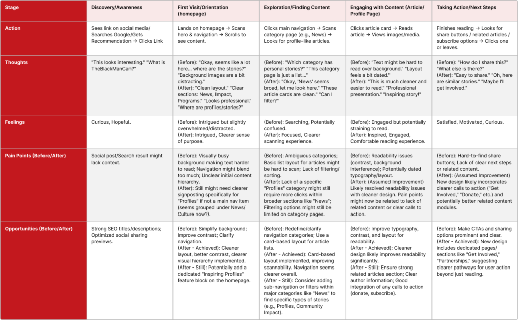
- Key Pain Points (Old): Confusing navigation between sites, difficulty finding specific profile/story content, inconsistent visual experience, unclear calls to action.
- Key Improvements (New): Unified navigation, clearer content categories/cards, improved readability, dedicated sections for engagement (“Get Involved”).
Design Strategy & Wireframing
The research phase led to a strategy focused on:
- Unified Information Architecture: Creating a single, intuitive navigation structure for the merged site.
- Content Prioritization: Emphasizing the foundation’s mission, impact, and programs.
- Streamlined User Flows: Making it easier for users like Marcus to find inspiring stories and ways to engage. (Include 1-2 key wireframe examples if available, showing the structural changes)
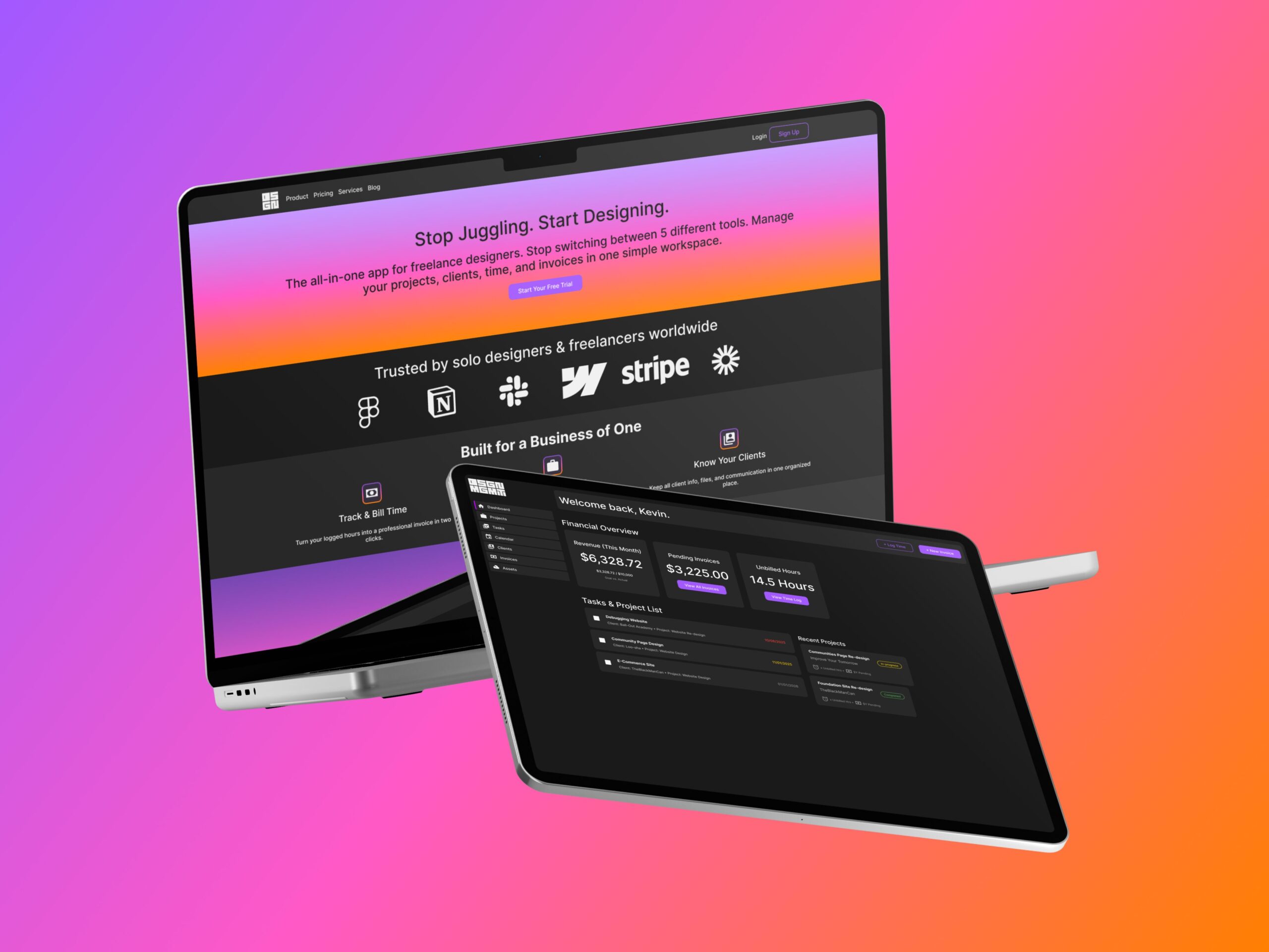
Visual Design & System in Figma
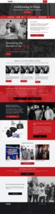
- Brand Enhancement: Refined and modernized the existing visual identity, establishing a clean, professional aesthetic with strong typography and imagery, suitable for the foundation’s mission.
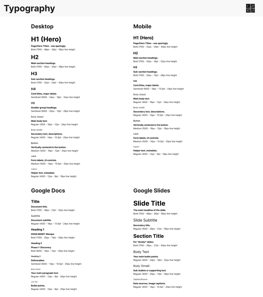
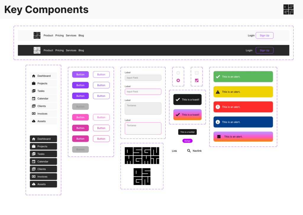
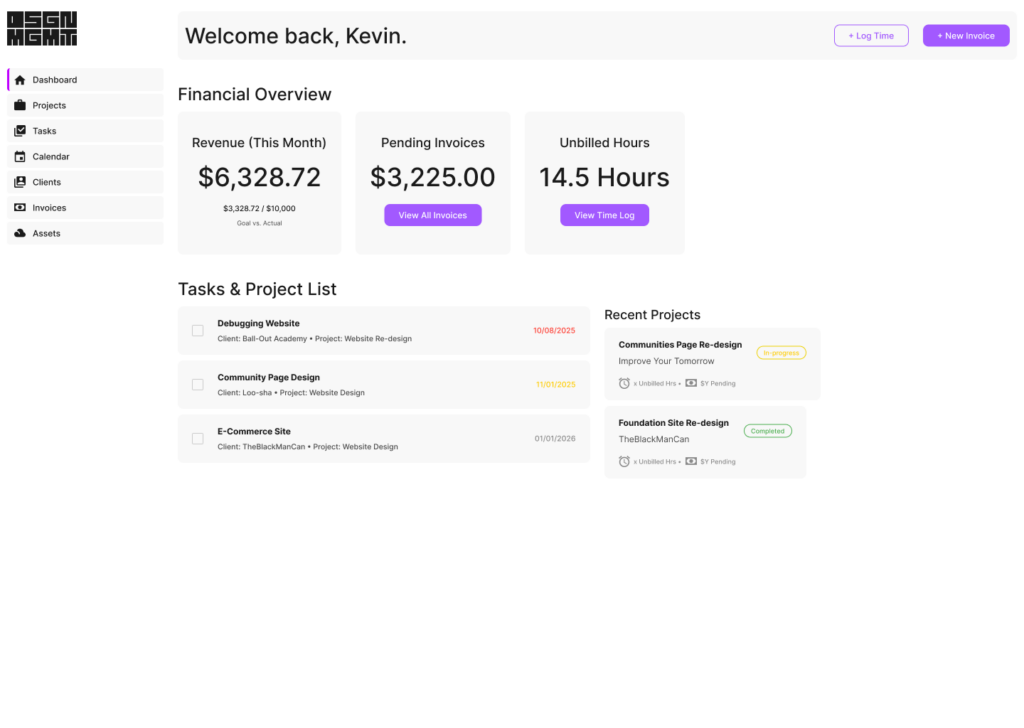
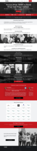
- UI Design: Designed key page templates and components in Figma, focusing on readability, accessibility, and brand consistency.
- Component Library: Created reusable components (buttons, cards, navigation elements) and defined styles (colors, typography) in Figma to ensure consistency and facilitate efficient developer handoff.
Handoff & Implementation
- Provided detailed Figma prototypes and design specifications to the developer, Tirzah, ensuring a smooth transition from design to live site. Maintained close communication throughout the build process.
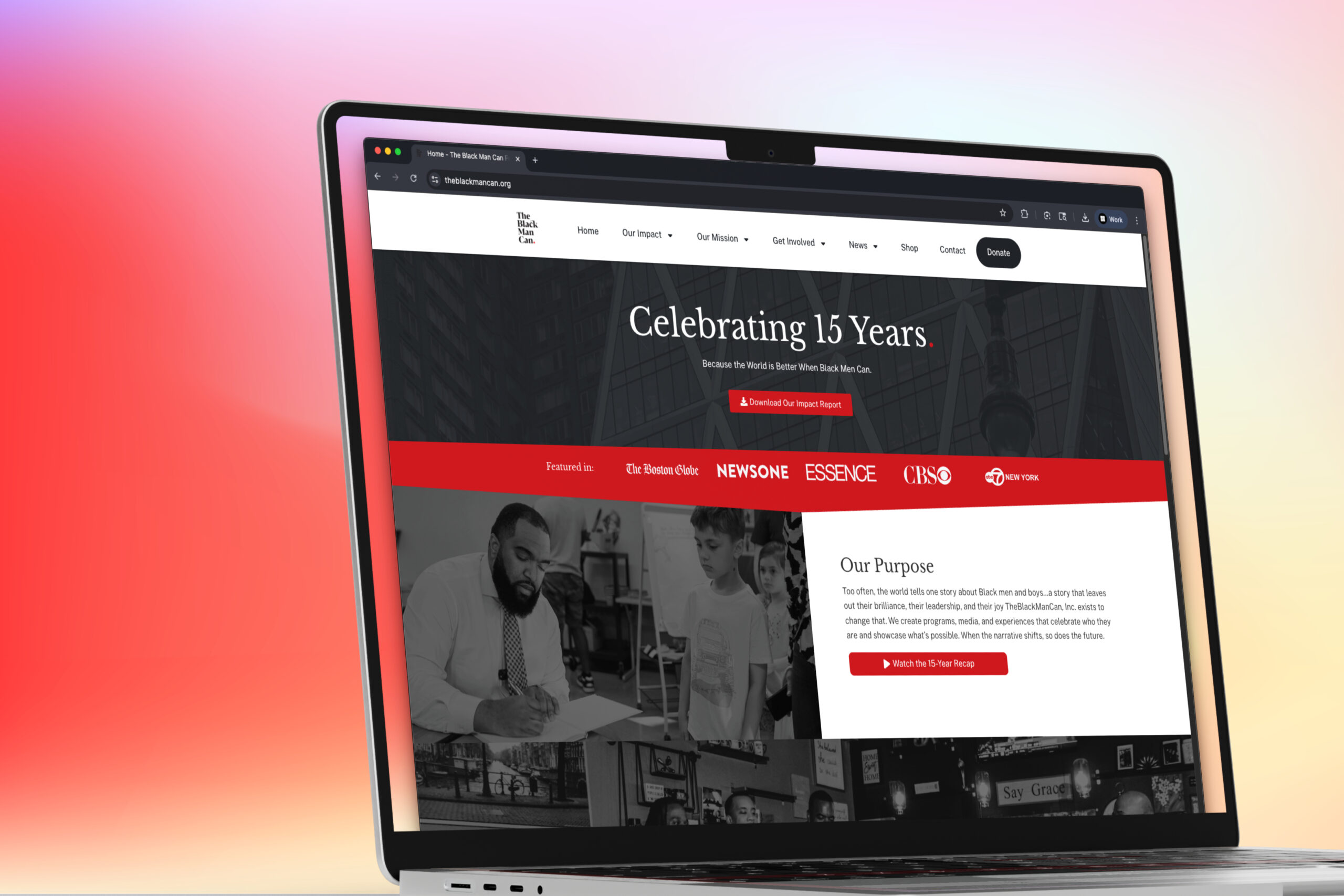
The Solution & Outcome: A Unified Platform
The redesigned TheBlackManCan.org successfully integrates the content and purpose of two previous sites into a single, impactful platform.
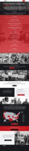
- Consolidated Experience: All content (News, Programs, Impact Stories, Get Involved, Partnerships) now lives under one roof with clear navigation.
- Mission-Focused: The design prioritizes the foundation’s work, impact, and ways for the community to connect.
- Improved UX: A cleaner layout, card-based content presentation, and refined information architecture make the site easier to scan, read, and navigate, directly addressing pain points identified in the user journey.
- Modernized Brand: The updated visual design presents a more professional and engaging face for the organization
.
Key Learnings
- The Power of Consolidation: Merging the two sites significantly clarified the brand message and improved the user journey, demonstrating the importance of strategic information architecture.
- User Journey Mapping Value: Comparing the “before” and “after” user journeys clearly highlighted the UX improvements achieved through the redesign.
- Design-Dev Collaboration: Close partnership with the developer was crucial for successfully translating the Figma designs into a functional website.