
The Challenge
Freelance designers often juggle multiple tools – one for project management, another for time tracking, a separate app for invoicing, and yet another for client communication. This fragmentation leads to inefficiency, lost billable hours, and a disconnect between managing work and managing the business.
DSGN MGMT was born from this challenge: How can we create an all-in-one platform tailored specifically for solo designers, helping them stop juggling and start designing?
Furthermore, launching a new SaaS product requires a cohesive brand experience from the very first touchpoint. The core design challenge became: How do we build a flexible, scalable brand system in Figma that works seamlessly across a persuasive marketing website and a functional, data-dense application, ensuring consistency and efficiency at every stage?
My Role: Founder & Full-Stack Designer
As the founder of DSGN MGMT, I wore multiple hats throughout this process, driving the project from concept to a functional prototype:
- Brand Strategist: Defining the target audience (solo freelancers), value proposition, and core brand identity.
- Product Designer (UX/UI): Leading user research, information architecture, wireframing, prototyping, and building the design system in Figma.
- Marketing Designer: Creating the public-facing website and initial campaign assets.
The Process: From Strategy to Scalable System
My approach focused on building a robust design system first, ensuring that every subsequent design decision was efficient, consistent, and scalable.
Part I: Defining the Brand & Foundations
The brand needed to feel modern, creative, efficient, and trustworthy. We established a core identity built on a vibrant “Modern & Creative” palette (Electric Violet, Bright Magenta, Warm Orange) balanced with clean neutrals for UI flexibility.
Foundations Built in Figma:
- Color System: Implemented using Figma Variables, including Primitive palettes and themed collections (Light & Dark modes) covering Brand, Semantic, UI Backgrounds, Text, and Borders. This allows for effortless theme switching.

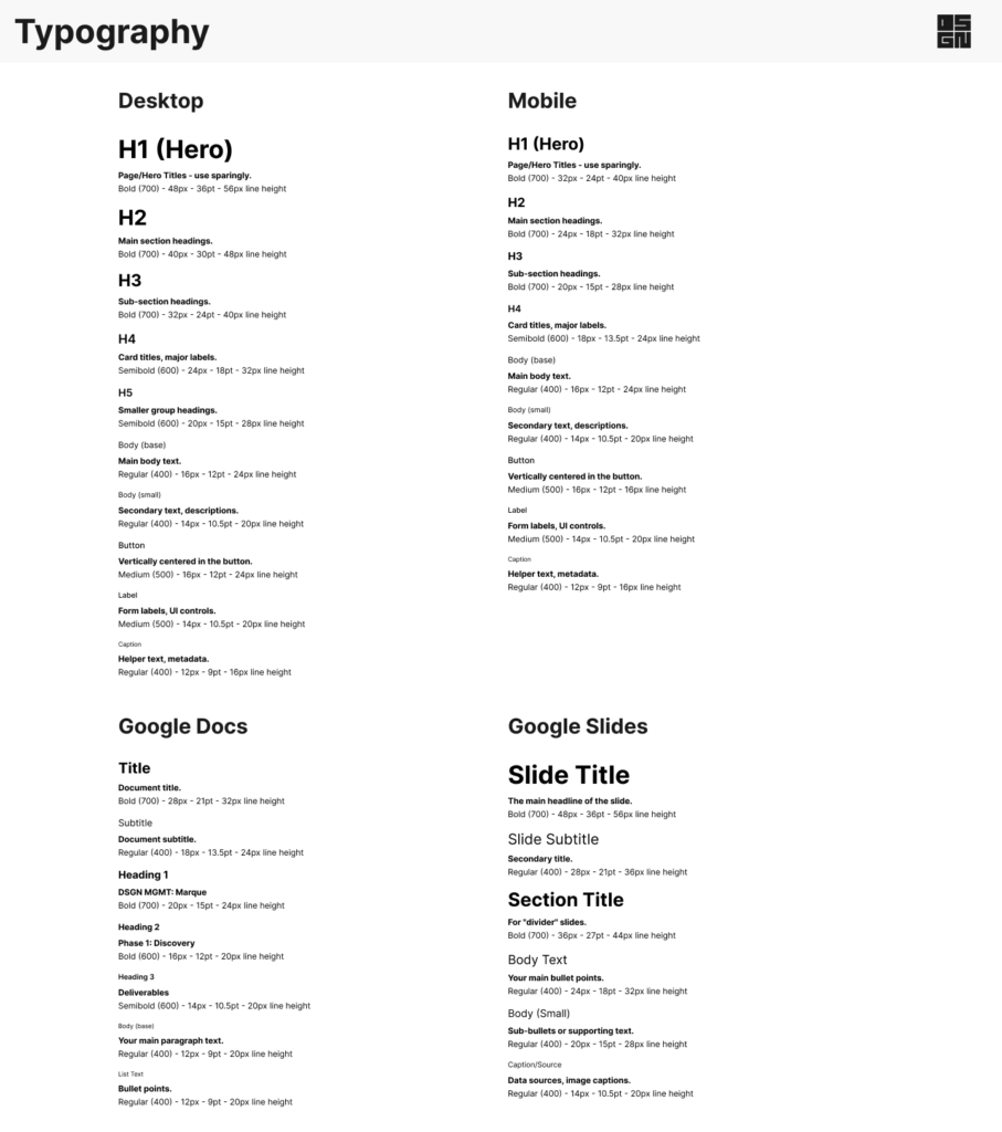
- Typography System: Defined comprehensive type scales (using Inter) for Desktop, Mobile, Google Docs, and Google Slides, saved as Text Styles for consistency across all platforms.
- Spacing & Grid System: Established a 4px base unit and a derived spacing scale. Defined and saved a standard 12-column layout grid as a Layout Grid Style.

- Effects & Iconography: Created standardized Effect Styles for shadows and radii. Componentized and systematically named a core set of UI icons

Part II: Building the Component Library in Figma
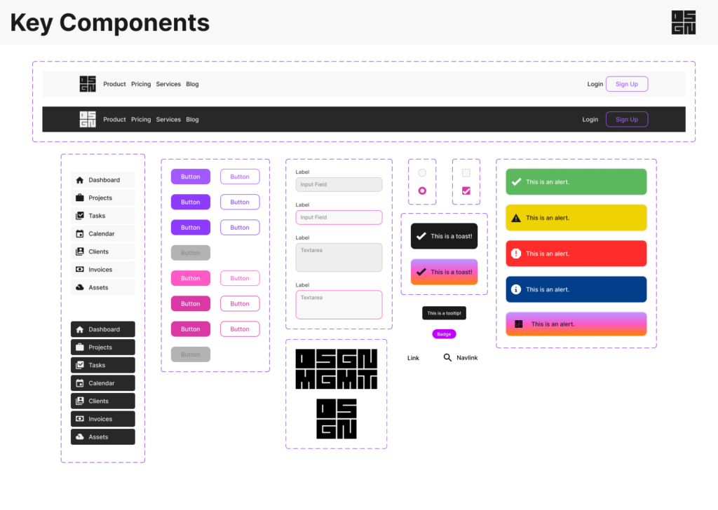
With the foundations set, I built a library of reusable UI components, leveraging Auto Layout and Variants extensively. This library serves as the single source of truth for both marketing and product design.
Key Components Included:
- Buttons (Primary, Secondary, Icon Only; Leading/Trailing Icons)
- Form Elements (Inputs, Checkboxes, Radios, Toggles, Dropdowns – with all states: Default, Hover, Focused, Error, Disabled)
- Feedback Components (Alerts, Toasts, Modals, Tooltips, Badges)
- Navigation Components (Global Header, Sidebar Navigation, Tabs)
- Core Structure (Cards)
Part III: Applying the System – The Marketing Website
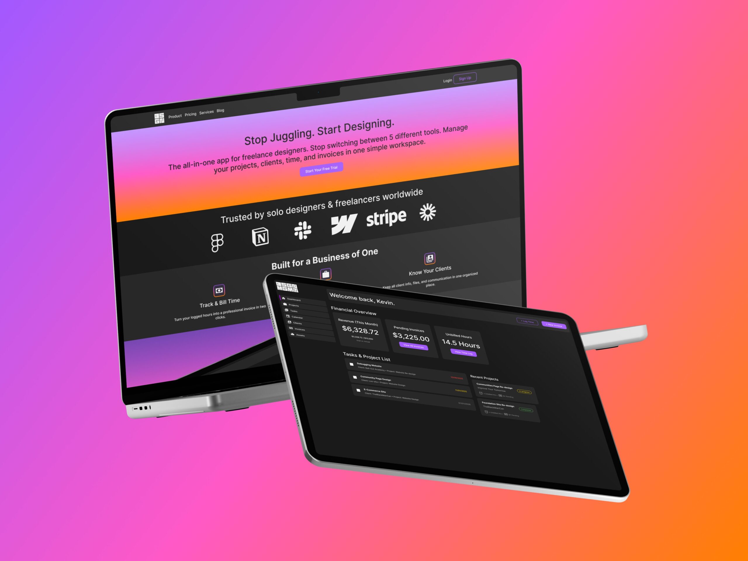
The first application of the system was the public-facing marketing website. The goal was persuasion and driving sign-ups, utilizing the brand’s expressive elements.
- Layout: Employed generous whitespace and the 12-column grid, mixing full-bleed sections with card-based layouts.
- Color & Style: Leveraged the vibrant “Aurora” gradient in the hero, primary Electric Violet for CTAs, and secondary accents strategically.
- Result: A polished, visually impactful site that clearly communicates the value proposition to solo designers, built efficiently using library components.

Part IV: Applying the System – The In-App Experience
The same system needed to adapt to a functional, data-dense application environment focused on efficiency.
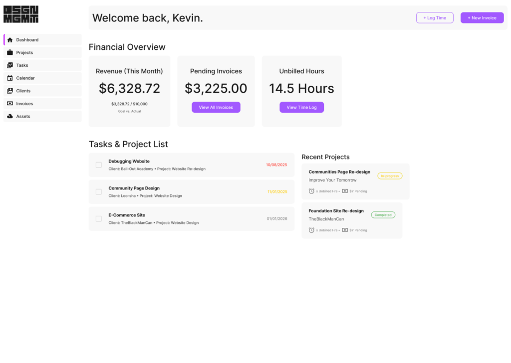
- Layout: Shifted to a tighter, card-based layout using the Sidebar Navigation, prioritizing information density.
- Color & Style: Implemented both Light and Dark Modes using the established color variables. Emphasized functional, semantic colors for status indicators (tasks, invoices) over decorative gradients.
- Result: A clean, scannable, and highly functional dashboard prototype tailored to a freelancer’s workflow, demonstrating the system’s flexibility across vastly different contexts. Furthermore, the application interface was designed with a real data structure in mind, utilizing Google Sheets as the backend, allowing for potential integration with Google Workspace automations.

The Outcome: A Cohesive & Scalable Foundation
Through this systematic approach, DSGN MGMT achieved:
- A Cohesive Brand Identity: Consistently applied across both marketing touchpoints and the core product experience.
- A Scalable Design System: Built entirely in Figma using best practices (Variables, Components, Auto Layout), enabling rapid design and development for future features.
- Targeted User Experience: Designs specifically tailored to the needs and workflows of solo freelance designers, focusing on efficiency and profitability.
- Functional Prototyping & Automation Ready: Developed a functional prototype using Google AppSheet, demonstrating the feasibility of connecting the design system to a live Google Sheets database. This structure allows for future integration with Google App Script to automate workflows like client onboarding via Google Forms and invoice generation from Google Docs templates.
Key Learnings
- System First, Pixels Second: Building the design system foundations before designing final screens was paramount. It enforced consistency and dramatically increased the speed of iteration for both the website and the app.
- Variables are Transformative: Implementing colors using Figma Variables made managing Light and Dark modes incredibly efficient and scalable.
- Context is King: The same brand system could successfully adapt from a vibrant marketing context to a dense, functional UI by prioritizing different aspects of the foundational rules (e.g., color usage, spacing). Designing specifically for the solo freelancer resulted in a more focused and potentially valuable product.
- Designing for Data & Workflow: Designing directly on top of a planned data structure (Google Sheets) highlighted the importance of considering backend constraints early in the UI design process and opened up possibilities for powerful workflow automations using tools like Google App Script.
Leave a Reply