About the Project
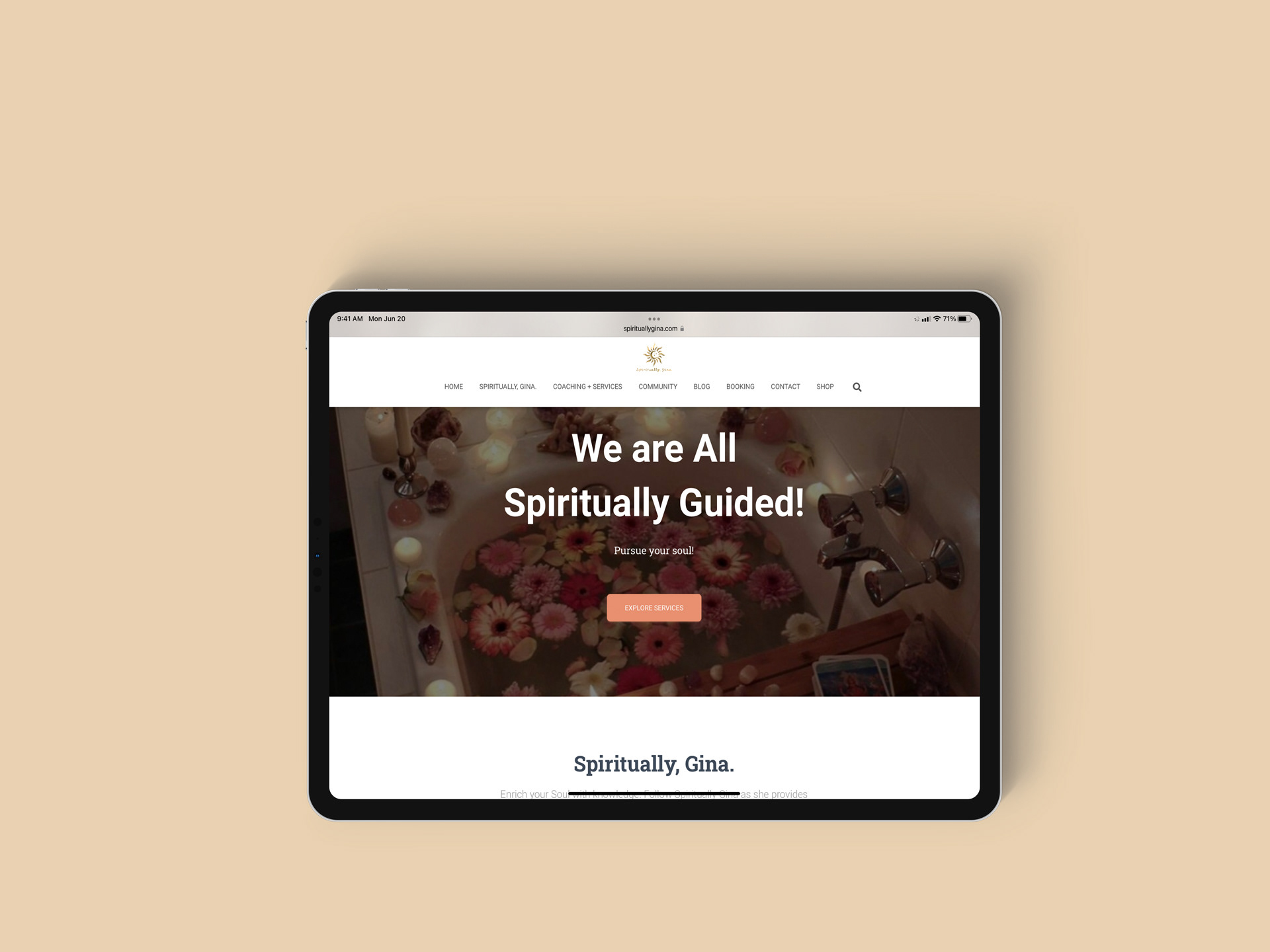
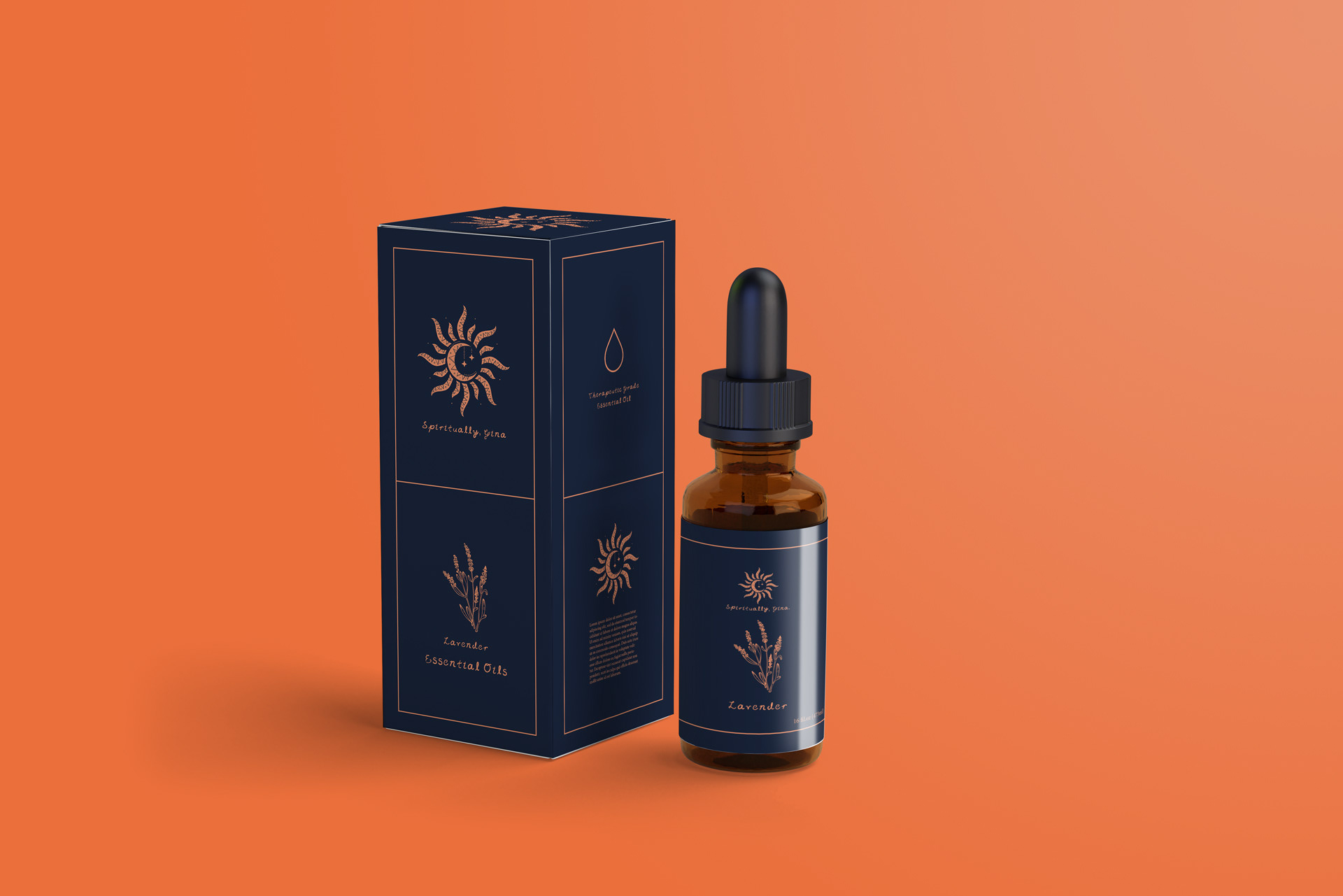
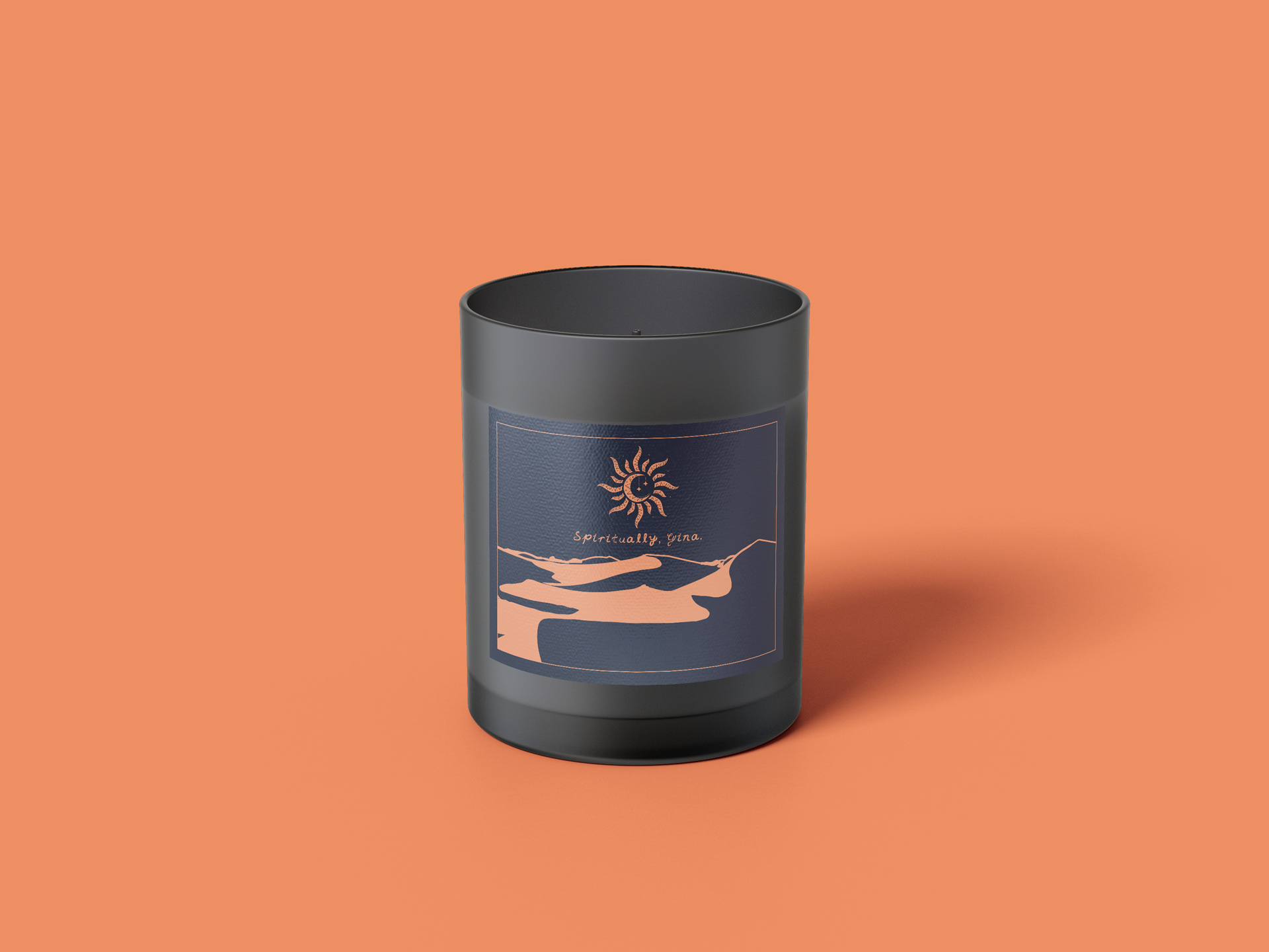
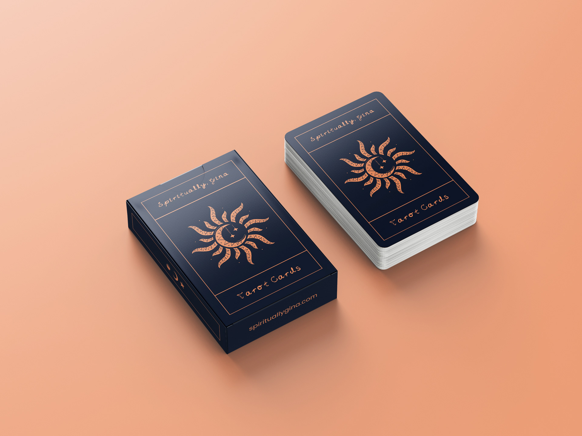
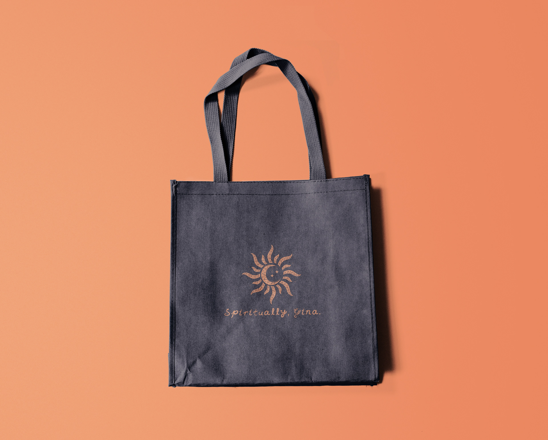
Spiritually, Gina is based in North Carolina, and provides services in tarot and oracle card readings and chakra healings. This project was done in part with GigiOnBrand, a brand strategy agency in Los Angeles, CA.
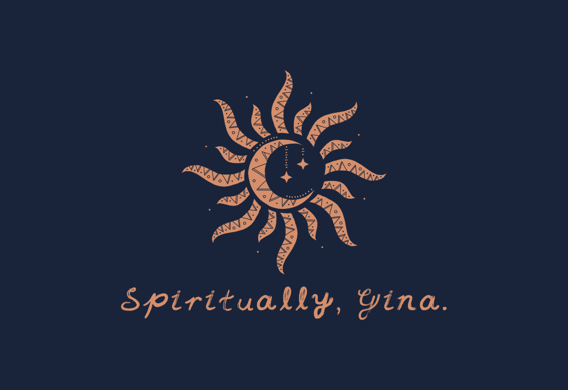
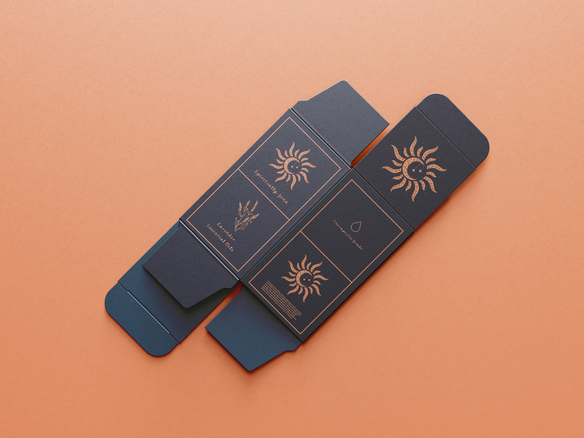
Logo Design
The combined Sun Moon and Star logo was a derivative of a previous logo that included three separate sun, moon and star. The goal behind this particular redesign was to minimize the full logo to a single logo mark to deliver a more effective visual brand appeal.
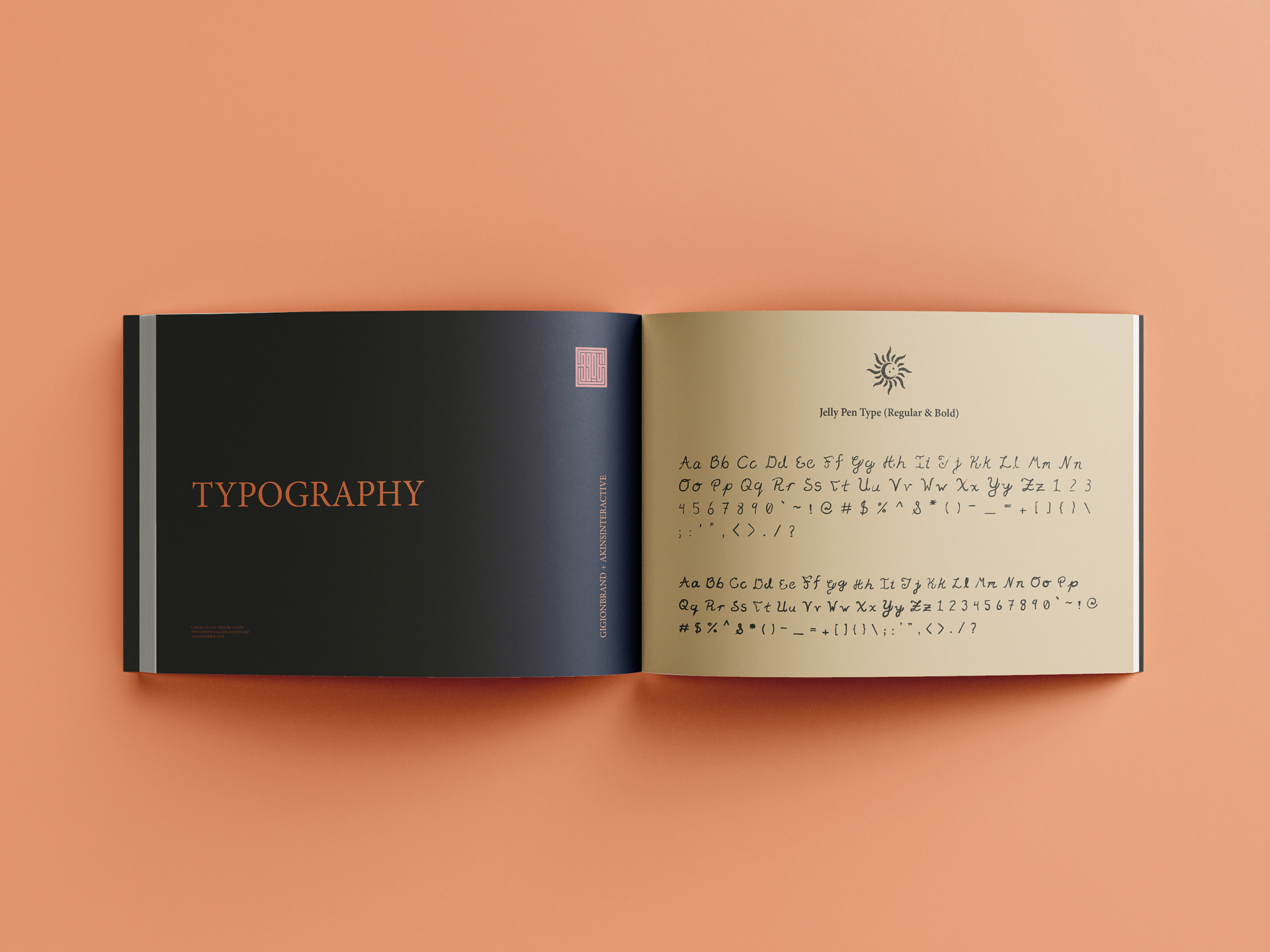
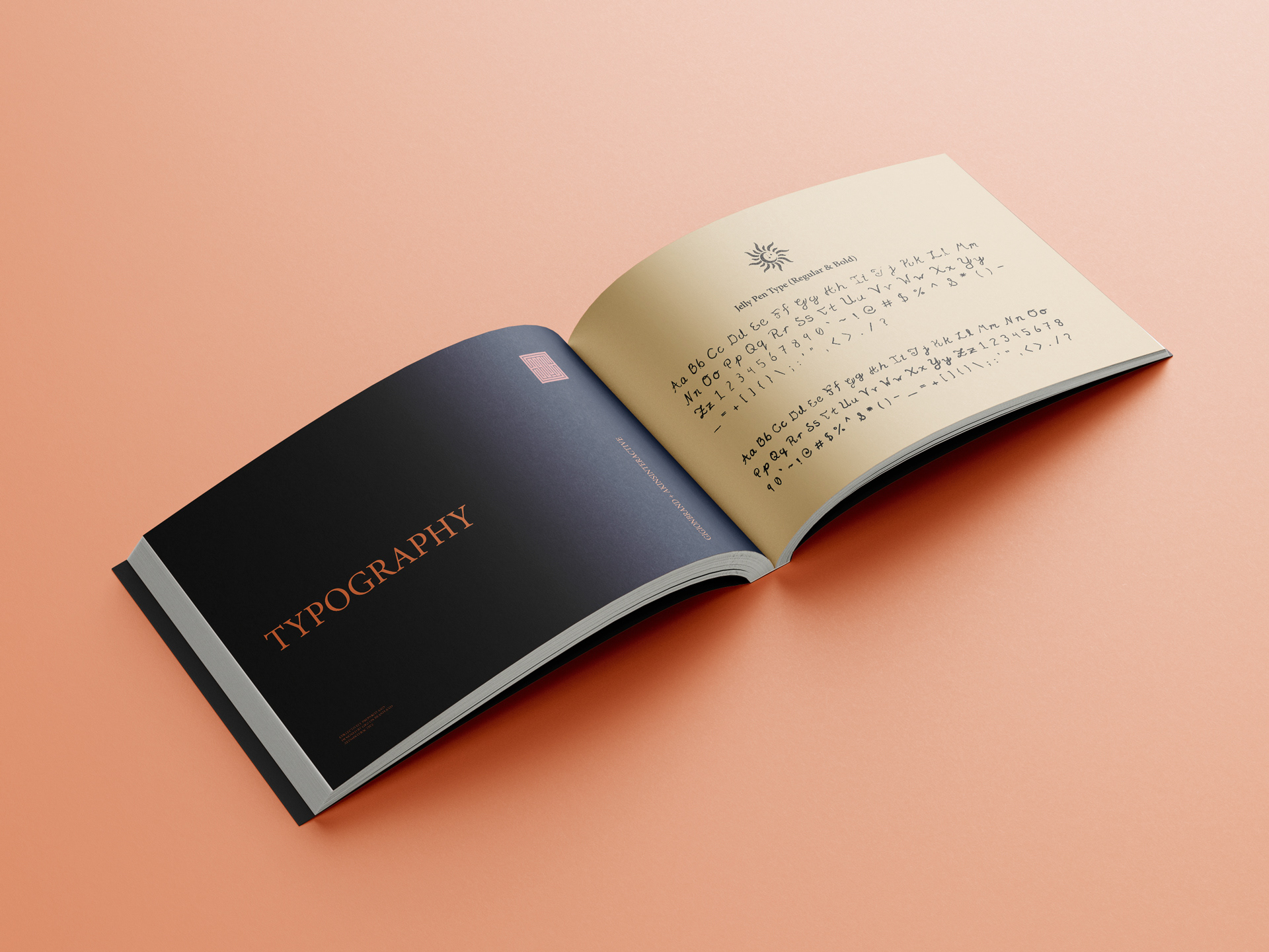
Font Design
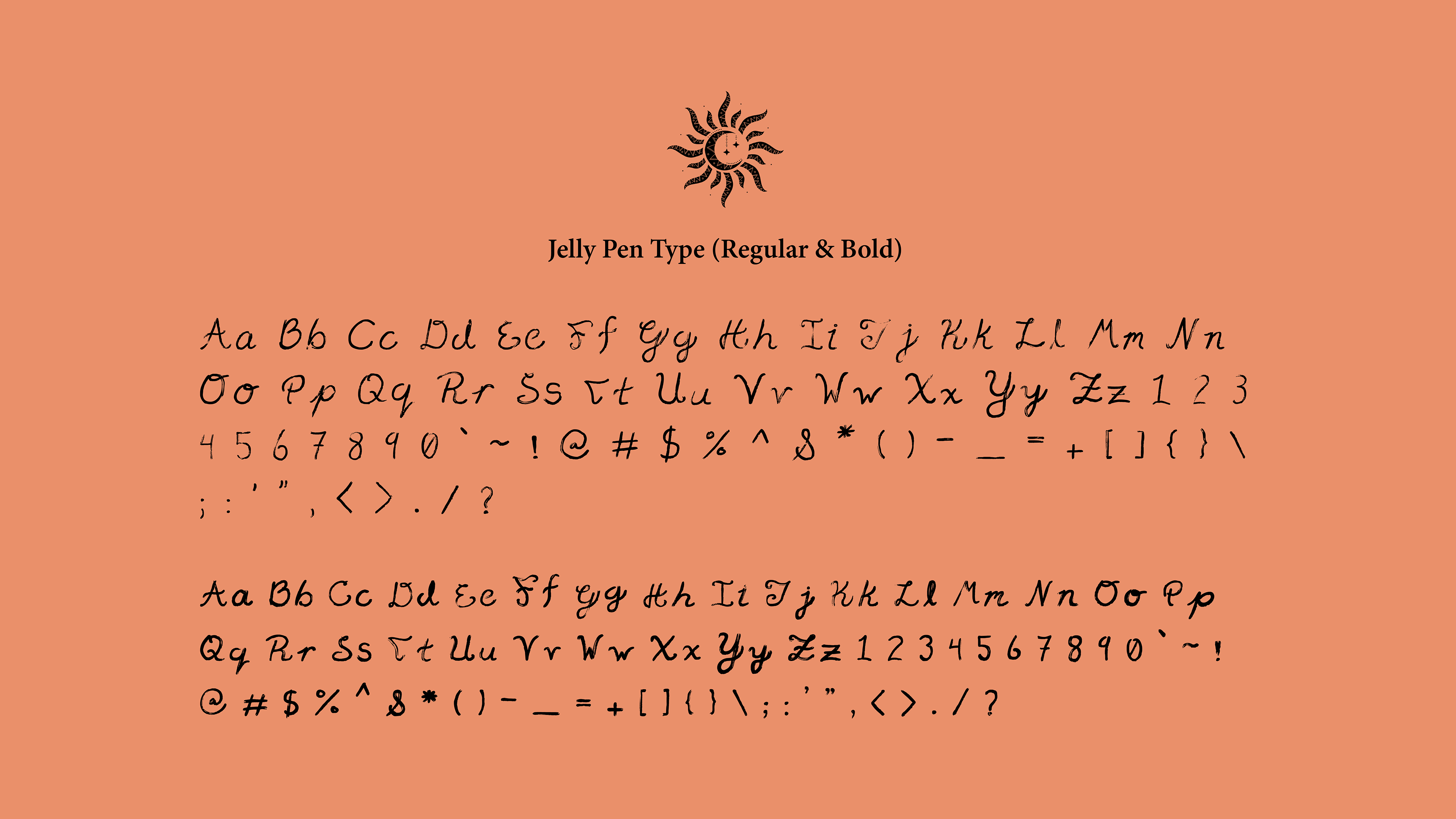
Jelly Pen Type may seem a bit off-the-cuff for it’s unorthodox appearance, but that was all part of the challenge. Spiritually, Gina wanted a font that appeared organic so building a typeface that went against the anatomy of typical lettering was the assignment at hand. In the end, this font compliments the logo mark well.
© AkinsInteractive. All Rights Reserved